The core idea of Flattr is great. You define a set amount of money each month (say $5) to tip content creators. Then, whenever you see something you like, you click their Flattr button and they get given a slice of your monthly quota. The size of the slice depends on how many people you tip that month – the more you tip, the less each individual gets. The concept is a bit weird at first, but if you think about it, the idea of a single-click micropayment tool is actually quite compelling. There’s no stop-and-think “how much should I give” step. There’s no worrying about hitting or going over your quota. You can click away with reckless abandon, in the same way you’d tweet, like or share content.
It’s somewhat similar to giving coins to a street busker – the exact amount really doesn’t matter to you, but the fact you’re giving something at all can have a big impact in aggregate with everyone else. The potential is huge if Flattr gains critical mass, but they simply haven’t got there yet. They’ve only logged 118k tipped items since they launched in March 2010. So why hasn’t critical mass occurred? If we take a closer look at their sign-up and ramp up process, you’ll see that user experience is clearly an important factor.
Instead of giving you my opinion, I’m going to pose this as a question – if you were going to design Flattr’s sign-up process, is this how you’d do it?
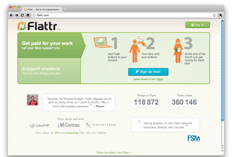
Above we have the Flattr homepage. Note that the main proposition displayed (“Get paid for your work…”) is aimed at publishers, not readers – while readers are likely to vastly outnumber creators (the 1% rule). With this in mind, and looking at the 3-step walkthrough, what do you think they’re doing wrong here?
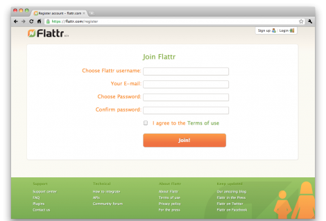
If the user clicks the “sign up now” button on the homepage, they end up here – a standard looking sign-up form. When the user registers, they are sent an activation email, which they then need to click, and then are taken to a blank login form which they have to fill in. They are then taken to the page below.
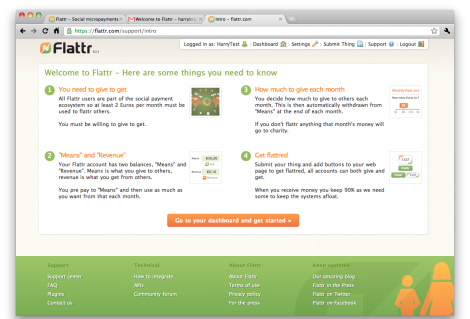
Above you can see the interstitial instruction that they are taken to. There’s a lot of information here, which they are meant to consume before proceeding to the dashboard.
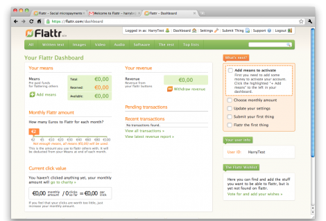
Finally the user gets get to the dashboard (above). The wizard has ended, and now the user is free to explore and do whatever they want using the interface. But there are still some highly important actions required. They have to put some cash into the system, and set their monthly quota. In case you’re wondering, the items in the orange box at the top-right of the page are not clickable.
Another issue to be aware of is their lack of a viral strategy right now. If I take the time to register on Flattr, I can then only give money sites that have already been set up for Flattr by the site owners. I can’t, for example, email you a tip via Flattr, and in doing so give you a compelling reason to sign up for the service.
So, there we have it – a brief walkthrough of the Flattr sign-up and ramp-up process. I’ve actually spoken to them and they’ve told me they’re very interested in taking on board feedback from the UX community. Please add your comments below to help shape what could be a great micropayments system.


As a graphic designer, I can see there’s some problems with the homepage. There’s no slogan. White text on pale green is not great for legibility. The male/female iconography is kind of redundant. It works in the video, but the big orange stick figures dont communicate much in the 1/2/3 steps thing. Likewise, the slice of cake works in the video because the cake metaphor is explained, but in the static image it’s hard to identify as a slice of cake, and it’s a leap of imagination to understand why it’s there.
If I worked for them I’d mock up some different designs in photoshop and run them through http://fivesecondtest.com/ or something like that.
Alright then, I’ll have a go at it :-)
From what you’ve described above, and the screenshots, it occurred to me that the whole process is really highly skewed towards the people who aspire to become content creators (and get Flattred as a result).
Now we know there’s this 1% rule, also known as participation inequality, based on which vast majority of people are not interested in creating original online content.
The process 1) makes it looks like you need to be an active content creator to be able to participate, and 2) does not really persuade you to make the first, and most important, leap of faith and register your payment card. Or direct debit, or whatever the payment method. The interstitial instructions screen explains that money is then to be taken each month regardless of whether you spend it or not. And that is quite a big psychological commitment, even though the actual amount might be a just few pounds.
The Dashboard also makes it look like ‘Submit your first thing’ is part of the ramp-up phase and is a mandatory step. Again, since most people who might be potential givers of Flattr don’t aspire be Flattr receivers as well – this might put off many.
All in all, I think the designs make some assumptions about people’s motivations for participation that might not be accurate, and target mainly potential user groups that are not essential for the service’s take off.
The lack of a social media strategy is then almost a suicide today.
Sign-up processes are such a messy thing, I’d love to hear other people’s opinions.
Great that you brought this up! I have been wondering about it, too. It looks pretty professional graphically, but something is missing in the UX.
What struck me in the process was that I was unable to Flattr anyone before having registered a credit card – even though I was registered as a user already.
This might seem to make sense, encouraging people to commit early. In the end, allowing users the workflow they prefer – trusting the service when they choose to – might be likely to help users feel the service is trustworthy in the first place.
That is, the needs of the following scenario are not met: you are a skeptical user and don’t want to commit just yet, but are keen to keep track of content that you like – in order to perhaps actually pay them later. One might want to pay once one has found enough content to make actually using the service worthwhile/personally meaningful.
I also think the processes for consumers and producers should probably clearly compartmentalized: the choice of whether one wants to consume or produce should be made more explicit so that everyone is aware that they are making the choice.
It should also be made clear that you can later become a producer if you want to, but the unnecessary details should be hidden from consumers by means of progressive disclosure (http://www.useit.com/alertbox/progressive-disclosure.html ). Producers can perhaps be expected to be committed enough to learn the added conceptual complexity: after all, there is money in it for them.
Also, why aren’t they visibly promoting the top sites that can be Flattr’d on the front page? Unless you’re a visionary that really wants this to happen, there is little to motivate the ordinary user to sign up for yet another online site. Seeing some content they love and can support is what could to that.
Olli
The wizard is too short. It should take you through the steps of loading balance onto your account and setting your monthly quota. Plus what everyone else said.
My 0.02:
–when I get to the end of the wizard I want to be set up – not ready to get set up.
–I’m still confused by who is following the wizard as described. Is it only content creators, or do I use this wizard if I want to grab some content and tip the person? Please make it easier, as I am an idiot (jokes aside – you ignore this at your peril).
Love the idea.
Paradox of choice – how much credit should you credit buy at the start? How much should you pay each month? It’s going to put people off.
Reduce the range of options to three items, like 37 signals do for basecamp:
http://basecamphq.com/signup
Maybe the recommended package should be 10 euros of credit, covering you for 4 months of donations. Something like that.
Loved this analysis. It shows how important it is to think about who you’re designing for and what they’re trying to achieve.
I’ve added a link to it on our forms advice web site on the page about ‘Relationship’ – thinking about users and their goals, and what your organization is trying to achieve as a business.
http://www.formsthatwork.com/Relationship
Great stuff!
We love the feedback, give us the hard times as we now it kind of suxx ;)
Some “answers” to why it’s like it is that might explain why we did the choices we did. Not to say it’s the best choices just to clarify why we did what we did.
About focusing on producers: As is mentioned in the base article you can only flattr registered things. So the main “problem” we have is to get the content flattrble. Hence we choose to focus on the content creators.
Submit your first thing: Is not mandatory, it says “please go here so you know where you do it” basically, might not be a good call, but for the 1% that has content it’s important to show them how it’s done. And we also want to promote adding your blog even though the main reason for joining is to give.
The lag of social media strategy: This is just plainly due to lack of time, it’s awful that we don’t have any of those stuff. Ideas and stuff in this area are VERY welcome.
Flattering without money: As a flattr is a monetary thing, you can not flattr before you added money. If we could do anything good about that, would be great. I don’t see how though. (Except a bookmark system of some kind, but will complicate things even more.)
About consumer/producer: We are planning a wizard for users with separated paths for consumer/producer, but we also want users to do both and know they can, so it’s a bit complicated to do good. Progressive disclosure would be a good thing to use as a result of that kind of wizard.
Top sites on homepage: We don’t like the idea of editorial content on flattr.com as we want to treat all users in the same way. But we know it probably is a bad decision for growth.
Recommended package: As you can change your monthly spend any time and also do direct donations to flattr users now, a “package” can’t really be made, sure you can say “10 euros, will work for 5 months of 2 euro flattrings” but then you kind of say that is the way the system works too.
Linus
Top sites on homepage:
Publish in order of the number of flattrs
Flattering without money:
Send a message sharing user details
“Hey @Linus, @Craig loves your work, but hasn’t committed funds to Flattr yet. Why don;t you get in touch!”
About focusing on producers:
“I haz internetz” A button up front? Two sign-up pathways? Surely its not too hard.
Social Media strategy
How many hours to build a “tweet each flattr?” One? Two? For what benefit? Maybe huge?
As a site owner I tried to sign up last month but gave up as it was too complicated. The potential micropayments for me are small enough for me to not want to try hard.
Your model relies upon huge amounts of small transactions, right? Every blogger and site owner should have flattr, right? It should almost be a once click exercise.
I’ll come back if you get better.
Anyway – good luck with it. Great idea.
re: Linus
You said “About focusing on producers: As is mentioned in the base article you can only flattr registered things. So the main ‘problem’ we have is to get the content flattrble. Hence we choose to focus on the content creators.”
So, you created a problem with your current design (content can only be flattrable when registered by the webmaster/owner), and then you’re trying to solve it with more design. You could simply take a step back and allow people to flattr content that’s not registered. Let people email flattrs to other people. I know it’s not an easy problem as you’re trying to prevent fraudsters claiming flattrs for content that’s not theirs, but there must be a better solution.
Pingback: axplock med webbformulär och näthat 2011-01-24 | axbom
I’m starting to wonder if you’ve missed quite a few of these things.
The tweet’s are there, if you Flattr things, or your content is submitted. It’s under your settings and “Twitter”.
The big orange box says “What’s next?” and describes to you how to put money into the system. As some people might just register to look into it, somehow forcing them to put money into the system if they just want to browes around can be disasterous.
Input is always loved and welcome by Flattr, I know that since I come with a lot of it myself, and thy are constantly working to meet peoples want’s and needs.
There’s also a Wishlist that is being built on for people to say “Hey we want to Flattr this!” and what features it is supposed to carry.
There’s also loads of suggestions and discussions ongoing on the Flattr-forum for how to improve! :)
Not sure if any of this made things clearer, but I hope so. :)
Oh and I want to add, there’s also this site:
http://iwanttoflattrthis.net/
I use flattr, it works well for me, and I love it and the people behind it. I agree about the UI/UX issues though and do believe that it is costing flattr potential users. My biggest qualm is that it is hard to find the content I like the need a pulse like reader app. Pulse has great UX/UI and design like that would be great for flattr.
Well I managed to surmount the registration process but my blog doesn’t have a Flattr plugin available so I went hunting for the raw Javascript code to add to my theme footer.
The ‘integrate’ page is either very badly designed, deliberately obtuse or something got lost in the English translation.
‘You find the code for both buttons on the Flattr page for the thing. The code is also displayed directly after submitting the thing.’
Only you don’t, There is no
block including the required JS code.Either that or the magic, hidden Easter Egg is only be made visible once you have activated your account by loading it with €€€.