A couple of weeks ago I wrote a post about the new Times.co.uk paywall, asking “If you were going to design a paywall, is this how you’d do it?”
Well, I’ve just noticed they’ve iterated the design, and guess what? It’s in line with many of your suggestions.
First let’s look at the old design:

Original times.co.uk paywall design (May 2010)
Your comments included:
- Simon Thulbourn: “Remove the giant image in favour of clearly defining what the user gets in return for their money”
- Paul Gordon: “…the registration page itself should have pricing options and free trial information”
- G Mulder: “what is this huge helicopter image trying to tell me? That SAS is gonna come and get me if I don’t sign up?”
- Johan D: “…neither the content nor the period is clear”
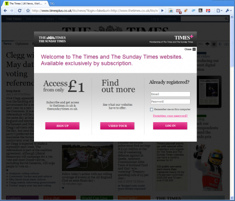
Now, check out the new design:

New times.co.uk paywall design (July 2010)
They seem to be iterating in the right direction, though some of your best suggestions haven’t been incorporated (clear pricing, lazy registration, teaser excerpts, etc), and bizarrely, they don’t mention the free trial until after you click through to sign-up. But let’s not forget, a UX designer’s job is never done. By keeping a close eye on their KPIs and iterating regularly, it’ll be pretty hard for them not to improve this… Right?
Who at The Times do I send my invoice to? Consultancy doesn’t come cheap you know… ;)
Seriously though, good to see a big player take heed of good UI suggestions. Hat tip to them for that at least.
It’s entirely possible that they didn’t read the original blog post, and they just came to similar conclusions through their own research. But yes, I too like the idea of a big org responding to points made in a comments thread… :-)
It’s better, but there are so many points they can still fix.
They have so much empty space they could capitalise on, when someone gets to the pay wall, make it an actual page, not a modal dialog screw up.
Make the paywall the first step to registering or to login. At the end of the login or registration process, take them to the article they were just trying to read.
Although, they have deeper issues than that. I actually tried to register and their process needs changing.
As for figuring out if they read the first article and comments, you could check your access logs for their hostname/IP addresses.
I can’t help but feel The Times will end up losing part of their readership because of their paywall.
Iteration is a good thing, but I’m still in amazement that they got it so wrong in the first place.
Spectacular arrogance or ignorance? Did they not test it at all? With so much at stake? I’m imaging comical meetings post-launch: “oh F*** LOOK HOW MUCH MONEY WE’RE LOSING!!!”
With the kind of resources they have, its mind-boggling, hence my previous comment about decision-making, and by extension process.