Mailchimp (the email marketing webapp people) have written about a really interesting piece of user research they ran using Amazon’s Mechanical Turk.
Within the Mailchimp webapp, you can upload an image as the banner for your email templates. To make it super easy to build your own template, Mailchimp are creating a new feature that parses the colour information your image and suggests an appropriate colour palette to go with it (i.e. for the page background, header, body text, links, etc). Neat idea.
So, they started out with 700,000 alternatives, which narrowed down to just under 26,000 using a few rules. However, this list was still too way long and contained quite a few ugly combinations of colours – what they really wanted was to offer a handful of aesthetically pleasing colour palettes for a given image.
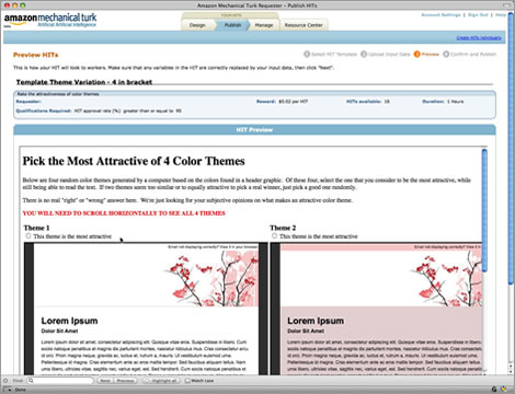
So, they gathered human feedback via Amazon’s Mechanical Turk, getting 503 people to carry out 85,000 small tasks in total, as pictured below:
After some hefty number crunching, they got the number down from 26,000 to 600 palettes, of which only a small subset would be offered to a user depending on the colours of their header image. Mission accomplised! It’s worth reading their original article, since it contains a few other quality insights, e.g. how they filtered out the dud data from turkers who gamed the system.
At 2 cents per task, I think this means the total spend was $1,700 USD for recruitment and incentives. As a point of comparison, this is how much it can cost to get just 8 users (that’s not a typo) recruited and paid for face-to-face research sessions. These two types of research are suited to very different contexts and findings, so obviously this is comparing apples to oranges, but still, it makes you realise how incredibly cheap it can be to gather human feedback using Mechanical Turk.
This strikes me as an effective use of Mechanical Turk, because they didn’t need to access their own specific user base – a large, fairly random assortment of humans were perfectly appropriate for making aesthetic judgements on colour palettes. It makes me wonder what other ways the UX community can take advantage of Mechanical Turk. Any ideas anyone?

Very interesting use of mechanical turk, but why not just use the top rated palettes from colourlovers.com?
Steve, I was thinking the same thing. I’m sure there are other ways of achieving the same goal, but they needed the color palletes to be paired with the banner images, and there were nuances such as which colour from the palette to use where, e.g. background, H1, body text, link colour etc. I agree, they could have just used existing resources like colourlovers.com and a graphic designer.
Mechanical turk could be used for adding metadata tags to content and for some types of card sorting. Not for usability testing, no way.
Pingback: הבלוגרית » ×רכיון הבלוג » מי צריך מעצבי×, יש × ×ª×•× ×™×!