A few days ago, a friend of mine told me a story about their first visit to IDEO. At one point in their tour they saw a dozen Design Researchers standing in a makeshift kitchen, each holding a different brand of frying pan, flipping pancakes over and over again. There was one person watching and taking notes on a clipboard.
Sounds bizarre, doesn’t it? Almost like a scene from Kitchen Stories. In actual fact, there was nothing weird going on – they’d simply been hired to do some design consultancy for a frying pan manufacturer, and they were doing a competitor evaluation. Some pan shapes, weights, sizes and materials are simply better suited to the ergonomics of pancake-making than others. By looking at the competitors, they neatly kick-started their knowledge of frying pan design.
Competitor evaluations are hugely beneficial at the beginning of a project, but for some reason they’ve got a bad reputation among many designers who see them as uninspiring and uncreative. Personally, I think this is nonsense. Knowing how a competitor solved a problem shouldn’t determine your solution, and without knowing the landscape of competitor designs you can easy stumble and waste time. Here’s an example: the Mail Online iPad app first-run user journey.
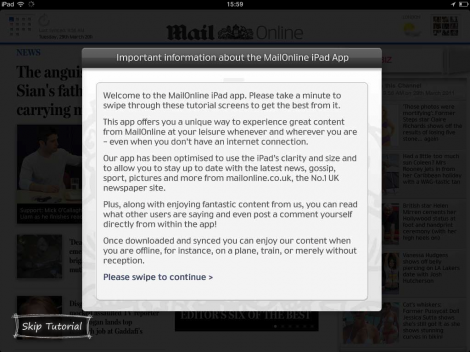
Step 1: when we start the app for the first time, we’re taken straight into a tutorial. What are we learning here? Not much, but there’s something about syncing mentioned there at the end.
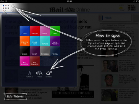
Step 2: a detailed explanation on how to sync. They’re clearly concerned about users syncing over 3G and then getting hit with a huge bill – a valid concern, but is it worth this much emphasis?
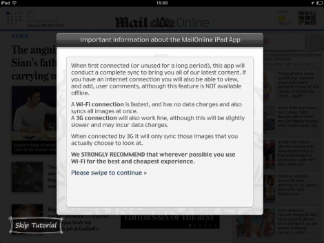
Step 3: another entire screen dedicated to syncing. That’s some heavy instructions right there.

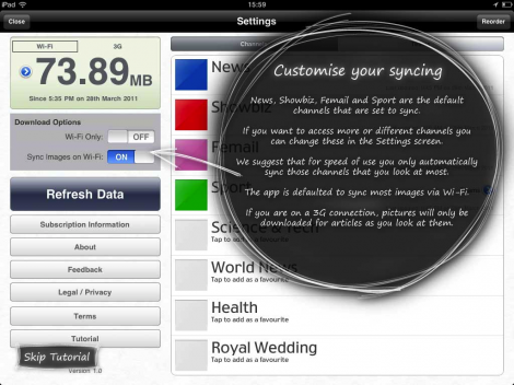
Step 4: can you believe it? Yet more information on syncing. What’s crazy is that there’s 15 more pages in the this tutorial. Lucky they put in that “skip tutorial” button!
Here’s my point: had the designers of the Mail Online app taken the time to do a quick competitor evaluation, they’ve have have realised that ZERO competitor apps make such a big deal out of syncing, and none of them are getting negative App Store reviews as a result – in fact, quite the opposite is true. Meanwhile, the Mail Online app has ended up with a tedious first-run experience. It pays to know which design patterns work well in your problem space and which ones don’t. Of course you’re never going to get a groundbreaking UX off the back of a competitor evaluation alone, but it’s a good place to start.
In other words – don’t forget to flip those pancakes.


