This talk by Professor Alan Penn of the UCL Bartlett School of Architecture is quite brilliant. He reveals loads of resonance between physical shop floorplan design and UI design for ecommerce, plus he explains exactly how Ikea employ Dark Patterns. Here are some excerpts paraphrased from Alan’s talk [notes in square brackets have been added for clarity].
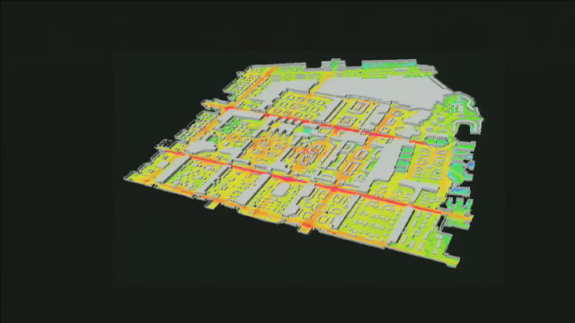
This is the groundfloor of Harrods [above]. One of the best tourist attractions in London.
They came to us with a problem. The problem was that on a saturday, they get double the number of people through the doors as they do on the weekday. And yet they only make 1.6 times as much money. They only get a 60% uprise from a doubling of people.
So they felt they had a problem – which was that the conjestion on the ground floor was so high, that they were stopping getting the passing trade. […] So we went to study it. we did an analysis of its spatial structure.
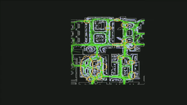
We observed how people moved around the whole of the shop floor. It turns out that the relationship between our analysis of spatial structure and the flows of people is a reasonable relationship. You can predict from spatial structure, flows of people around the store. However, what we found was that the flows of people did not relate to the number of transactions. So if you get the point of sale data, what you find is that what relates to the number of transactions was the static people, not the moving people. This was novel. […] It led us to be able to suggest back to the store managers that the real problem was not that the congestion was stopping people from passing, but that the congestion was inhibiting people from browsing. It actually stopped them stopping. You just had to keep moving because there was such a pressure from the crowd behind you.
Some of our most sophisticated retailers are the supermarkets and the large warehouses. They have wonderful data. You can follow people as they shop. Here, some people who do this kind of zig-zagging all over the place [below left]. This one [below right] is sombeody who shops and does those little forays up and down the aisles…. Quite often people who shop in pairs do this.
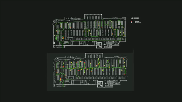
And you can do this for lots of people and you get a picture of of the way that shopping takes place. It turns out in these kinds of stores is that what makes money is not necessarily an obvious thing. […] Things like biscuits are very high in turn over – much cheaper [than wine] – but you make a profit on them. So there is a really interesting question that underlies profit that requires you to unpack exactly where the margins are on every line of goods. You have to look, in the store, at where all those goods are located. […] It’s all very well if people are passing through but it’s no good if they don’t actually choose something – if they don’t convert into a real sale.”
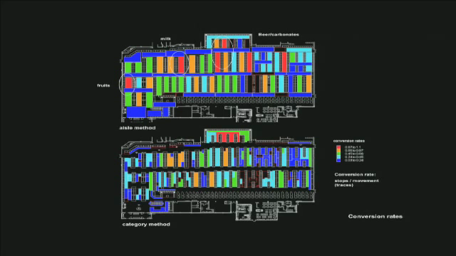
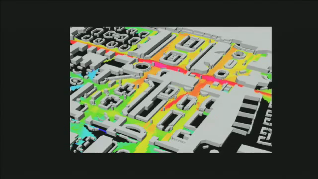
So here we are, with conversion rates. The red ones are high conversion rates. Fruit, milk, beer coffee, more beer…
In order to study this kind of thing, it makes an enormous amount of sense to compare one store to another store to another store, across a wide range, that are all trying to sell similar things. … And we had an opportunity to do this in a study of a large electronics store.
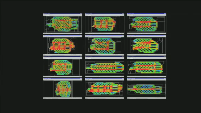
They gave us a dozen different store layouts, said they were all the same… We said no they’re not, they are all quite different actually! – And they gave us very precise point of sale data on where exactly they make profit on each line. Wonderful data actually.
Across that dozen set of stores, there was a relationshop between three factors that were spatial in the store, and the level of profit that they ended up making. The three factors were intelligibility (how maze-like the layouts were), accessibility, and the size of the visual field. If you close down the size of the visual field on average, and make people feel they are always in a small space, they get less understanding of what’s around them, and that seems to inhibit the profitability of the store layout.
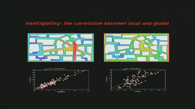
So what’s intelligibility?
[We] look at the local properties of the graph – how many streets cross this one, and how does that relate to where I am in terms of average depth from everywhere else in the graph – that’s a global property. Intelligiblity we define as the correlation between those two – To what extent does what I can see locally give me a good indication of where I am in the large scale plan of the whole thing. You can design things to destroy the relationship between the local and global [i.e. confusing], and you can design them so that the two correlate very closely [i.e. clear].
It’s something, by the way, that we find in a whole range of cities from around the world, organically grown settlements. They regularly create this property of correlating local to global [i.e. organically grown settlements naturally develop intelligible layouts].
Intelligibility is really important in the urban realm and in building interiors because it gives you autonomy. if you don’t know where you are, how can you decide where you want to go to? So… Removal of intelligibility, which is one of the things that architects can do … is like giving somebody a lobotomy. It removes your ability to act with intention.
Now – it’s very important for a space to be intelligible if you want to be able to search for what you want. And that’s all part of shopping. […] Now, a quote, from in the Susie Steiner in The Guardian in 2005:
“When you’re inside an Ikea store, you must come to terms with a near permanent state of bewilderment: shelves stacked with flat brown boxes labelled with random codes and names; a yellow road which takes you inexplicably through bedrooms when all you wanted was some kitchen handles. And then, then, when your emotional temperature is rising and you can feel a panicky hotness around your ears, you will be faced with Ikea’s version of customer care – an underpaid teenager, trained in psychic disengagement who’ll tell you they’re out of stock. The next delivery won’t be for two weeks. No, you can’t place an order, you’ll have to return to the store. That other query? You’ll have to ask someone in bathrooms … that’s five yards down the yellow road and the queue’s on your left.” – Susie Steiner, 2005.
Let’s try to get to the bottom of what’s going on in Ikea.
I had a Masters student a few years back called Farah Kasim, who went out to study IKEA. She had to draw the plans, then she came back and she analysed them.
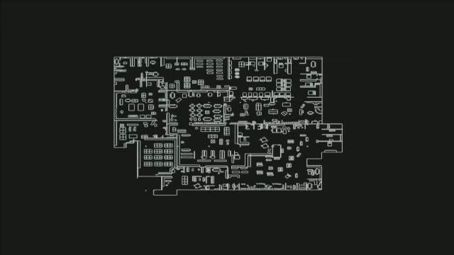
Now if you remember, the intelligible city layouts, they tend to have spokes around the hubs of a wheel.
So you’ve got a central area that’s really accessible and there are various ways in and out of the center, and perhaps the rim of the wheel of the outside will be accessibility.
And we look at the showroom part of IKEA [below]… and what you find is… goodness me, it looks like a really well working urban system. So my first feeling is that the computer has gone wrong. […] this is a complete shock to me.
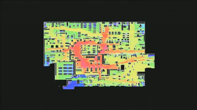
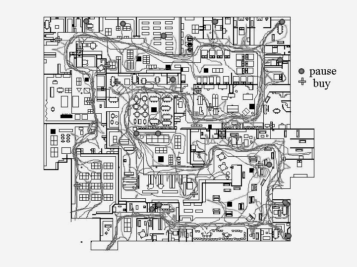
[…] She followed people around the store – and guess what they do – they walk around like this. You can see the sort of lines of people [below]. In fact, if you shop in Ikea, all you do is follow people around the store. You very seldom find people going the other direction. You do occasionally but they are always looking very harassed.
My colleague Alasdair Turner invented some wonderful software agents that have vision. They can see ahead of them with a field of view. The field of view is constrained by objects in the environment [shown below]. So they sit inside a virtual model, constrained by what they can see. Each time they want to make a step in some direction, they take a step to a point at random [within their field of vision]… As they move relative to objects in the environment, it changes the shape of what they can see next, and so it cycles on.

Let’s do this on the Ikea floor plane. Each of them, every time they step on a floor tile, they make it go redder, and every time a floor tile doesn’t get stepped on for a while, it goes bluer.
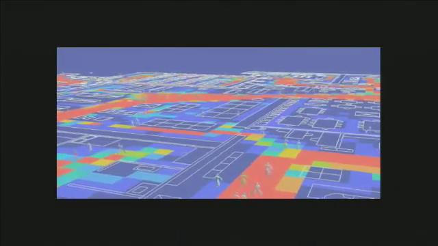
You end up with a sort of map of where the computer agents […] have actually ended up walking. And guess what, it’s very much like the pattern that we see for real people [edit: heatmap of real people vs heatmap of agents]. That tells us something very interesting. There’s a complete distinction between an analysis of space that takes no account of forward facing vision – of the way we are built into our bodies, with eyes in the fronts of our heads and a tendency to walk forward […] and an analysis that does not have this.
There is a complete disjunction between those two.
What Ikea have done is taken away something which is very fundamental, evolved into us, and they’ve designed an environment that operates quite differently, given that we are forward facing people, embodied […] from the way it would happen if you just looked down from outer space. Its effect is highly disorienting.
Ikea is highly disorienting and yet there is only one route to follow. […] Before long, you’ve got a trolley full of stuff that is not the things that you came there for. Something in the order of 60% of purchases at Ikea are not the things that people had on their shopping list when they came in the first place. That’s phenomenal.
So, what’s going on? Unintelligibility and disorientation removes your autonomy. They’ve extended the threshold at the beginning of the store to this whole showroom, and used it to remove your knowing-of-where-you-are. You have to submit. You can only give in and follow the route that they set out for you, because to do anything else is really difficult. In fact, there are shortcuts in Ikea. If you want to go upstairs into the showroom, you can then turn left and go immediately down the stairs into the market place and start shopping. Expert ikea shoppers know this. Part of the reason why they enjoy it is because they consider themselves to have expertise in how to shop it.
I’ll tell you the trick. If you want to know where the shortcut is – turn around, it’s behind you. Literally.
Pingback: Alan Penn on Shop Floor Plan Design, Ikea, and Dark Patterns.
Harry – amazing article. Love that user experience and data is combined to create a richer, deeper understanding.
Great article – loved the fact that the apparent simplicity of the conclusions is underpinned by some *serious* research. The stuff about Harrods reminded me of the “butt brush effect” discovered by Paco Underhill when researching why people who were clearly interested in buying ties at Macy’s, failed to make a purchase. The proximity of the tie rail to the main aisle meant that people passing through invaded the physical space of the person looking at the tie, making them feel uncomfortable and therefore unwilling to proceed. The obvious only becomes so once you factor in physical experience and capabilities.
On a closely related topic, I strongly recommend this book by Clotaire Rapaille: “The Culture Code: An Ingenious Way to Understand Why People Around the World Live and Buy as They Do.”
He developed some deep techniques of finding out what people REALLY wanted, as opposed to what they said they wanted. And for each product or service, there was a key word or saying that summed up people’s innermost feelings. Example: Jeep changed their vehicle design and one of the changes was from “old-fashioned” round headlamps to square. Sales were off. Rapaille found that because of the way people used their jeeps, the key concept was “horse.” It was something you “rode.” He said “put back the round headlamps to make it more animal-like. Sales zoomed. Many other examples.
Pingback: Charles’ Boise Blog
Pingback: Dark Patterns and Human Movement « Charles’ Boise Blog
Pingback: Retail space design – Web and at the Mall | A Better User Experience
Pingback: Del diseño de los centros comerciales | No sólo software