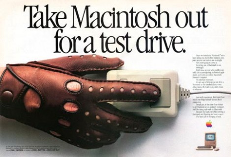
“The first business computer anyone can learn to use overnight.” (1984)
Try to think back to the first time you used a brand-new, ground-breaking, disruptive piece of technology. For me, I’ll never forget sitting in my bedroom in the early 1990s, going through the training application on my brand new Macintosh Classic. It explained how to lift my mouse when it got to the side of the mouse mat and position it back into the centre. It taught me the different functions of single-click and double-click, and how to select icons by clicking and dragging.
It was so new and so different, it didn’t actually feel intuitive to me. I could see that the Macintosh GUI was going to be far easier to learn than DOS, but at the same time there was still a fair amount of work involved. Ultimately, I didn’t care – it promised something so useful that the learning it was trivial in comparison to the benefits I stood to gain.
Now think back to when you got your first iPhone. Admit it – it wasn’t instantly easy to use when you first got it out of the box. Work was involved in setting it up. Sure, it was easy to unlock, flick left and right, start apps, and so on – but actually using it to get work done, that took some learning. Cancelling auto-corrected words. Copying and pasting. Creating bookmarklets in Safari. Entering the Euro or Yen symbol from the keyboard. Learning the work-arounds for having no file manager. They were lots of little mysteries and idiosyncrasies to start off with. Although it feels intuitive now, that’s learned intuitiveness, which, if you think about it, is a strangely wooly concept. Any interface can feel like second nature with the right amount of effort spent learning it.
My point is that disruptive technology is highly likely to be unfamiliar and will therefore have a notable learning curve. This raises some interesting problems for designers. For example, if your product has a painful learning curve, how can you convince people to invest time and effort in overcoming it? Back in 1984, Apple had to let people take home a Macintosh completely free for 24 hours, along with a 16 page instruction booklet (see Macintosh Ad above). Think about that for a moment – imagine designing something that required 24 hours of exposure for end-users to overcome bafflement and “get it”, let alone become a competent user. Web designers these days have it easy in comparison.
When the telephone was invented, Bell Co. tried to sell the patent to the British Post Office but they weren’t interested. The Chief Engineer famously responded “…we have plenty of messenger boys”. Bell then realised, like Apple did 100 years later, that people had to experience real usage of their product in order to “get it”. So Bell developed an aggressive adoption strategy to get telephones into peoples’ hands. They put phones in hotel rooms for calling the front desk, in offices as a replacement to intercoms, and near lunch counters in diners – a brilliant idea that not only got people to use them but also ensured people saw others using them in real life. It’s interesting to consider that today, Apple’s TV ads draw upon the same underlying strategy – the ads are presented like actual product demos. The viewer gets to vicariously experience real usage. The same goes for the hands-on nature of Apple Retail Stores, where anyone can walk in and play with any of the hardware for as long as they want. It’s not an act of kindness, it’s an adoption strategy.
Another problem you might face is knowing whether your product has a noticeable learning curve because it’s ground-breaking or just because it’s badly designed. The good news is that you can approach this with a simple heuristic: if it requires effort to learn, always start by assuming it’s just badly designed and let user research be your guide. Bear in mind, you’ll need to engage in longitudinal research to evaluate it properly. Typical usability testing, MVT and analytics doesn’t cut it because the time-frame is usually too short. You need to look at adoption over a period of weeks or months to get a true picture. Open and closed Betas are easy enough to implement with webapps, but physical products bring a whole different set of challenges.
What’s necessary is that you give your participants enough time to experience the strengths and weaknesses of your product in their own lives, and let them work out for themselves whether the benefits outweigh the costs of learning how to use it.
Great article.
I remember in 1986 when I bought my first Mac SE I actually had the salesperson provide a full day’s training on set up and how to use the applications I bought with it.
There was also a video on how to use the first Mac version of Word!
Later in life, from 1995 to 2000, I was a teacher who taught computer graphics on Macs to students who normally only had experience on cheaper PCs, so had to un-teach them DOS based habits they had gotten in to!