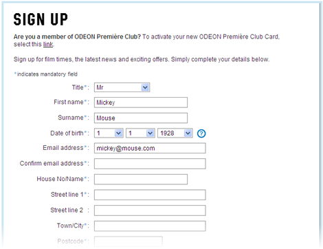
Here’s a nice antipattern from the Odeon (UK), who show us how to annoy 99.9% of users in an effort to help the 0.1% who enter their email addresses incorrectly.
So, here I am registering on odeon.co.uk…

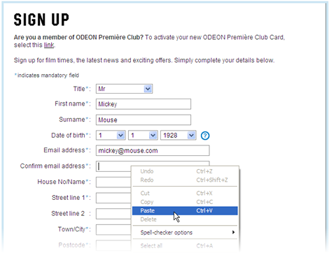
Oh look, I need to enter my email address twice. Never mind, I’ll simply copy and paste it…

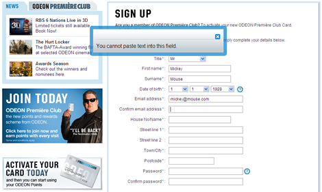
Job done. No, wait, WTF? They’ve disabled paste!

I’ve been a bad user, I must to stand at the blackboard during lunch break and write out my email address over and over again until I promise never to use shortcuts ever again!
Seriously though, typos in email addresses when registering is a real problem (more than typos in passwords, as Jeremy Keith points out – since if your email address is correct you can always reset your password, but not the other way round). However, this problem hasn’t really been solved properly yet – we don’t have a standard design pattern that we can just copy as needed.
UserGlue’s proposal looks promising, but it’s more of a prototype than a finished solution. Have you’ve seen any other attempts to solve this problem in the wild? Have UserGlue hit the nail on the head? I’d love to hear your comments…
There’s no way of solving it.
I do believe that entering an email twice isn’t a bad idea in general. You get to see the email entered a at least one more time and that increases the chance of getting it right. Prohibiting copy/pasting is wicked. :)
One technique I’ve seen is making an AJAX call to do a dns lookup on the domain of the email address supplied to check that it’s valid and has an mxrecord. This is an incomplete solution but does at least check part of the address.
I’ve found that the best way to make sure that people don’t make mistakes when they type their email is to make sure that they can actually SEE what they type.
This means making using a larger font in the signup form – see this good example from 37signals.
https://signup.37signals.com/basecamp/Free
Especially if it’s a small form, it makes no sense to have a couple of small fields in the middle of an empty page and have people struggle with reading what they type.
Even for larger forms, I’d favour a larger font size and improved input accuracy against worrying that people may find the page too long.
I recently saw a nice wrap up that summarizes in the solution: better present the entered address than let it be entered twice. Unfortunately I can’t remember where.
The email address entered should be presented in the way like “A confirmation will be sent to [email]” in a different typo (bigger, differernt colour).
The rationale behind the solution was that it is more likely that typos will be recognized when the object is read in combination with the action. And users swith from entering to reading which raises awareness.
@eincarsten
One of the links provided in this post leads to the post about what you and other folks are describing. That’s a great helper.
I disagree.
Mistyping your email has such severe repercussion that the couple of seconds inconvenience is worth it.
I’d be shocked if the number of users who mistype their email address isn’t far higher than 1/1000.
I know I have a number of times – once I even had an order cancelled (with no notification because they didn’t have my correct email address!).
Disabling copying does seem a little over the top – most browsers will auto complete anyway… but I’d be more annoyed about having to give them my exact date of birth!
Few people complain about having to type in their password twice (ok it’s obfuscated) but at least a mistyped password can be recovered if you have a valid email address!
It’s nice to have a healthy debate about these things – your disagreement is welcomed! My main problem with it relates to the fact that they disabled paste. It just feels so wrong.
The other thing to consider is how “life critical” the site is. Some accounts are more throw-away than others. There’s a big difference between online banking and joining a discussion forum, for example.
I do agree about messing with the browser behaviour – I can’t really imagine the design / process that got that implemented?!! I suspect a rogue developer!
The context’s certainly important – you wouldn’t want to type your email address twice in on the comments form on a blog or signing up for a newsletter.
It’s hilarious how you describe this site treating you like a child. :D Still, I’m surprised that no one has thought to be MORE helpful in these situations.
What about this approach?
Don’t ask someone to type in their email address at all! Have them SHOW you their email address using the typical manner that they send email.
Something as simple as a mailto: link could be used to push a “signup key” into whatever mail client a person uses. Have a backend process feeding the new account creation routine harvest the incoming email address and link it to the new account.
The experience is reduced to two clicks: one on the link, the other to send. Done.
Maybe offer a fallback experience of typing into two fields for people who dont have a mail client handy or configured (or want to split work/home email addresses in mixed contexts).
@tom: the reason most sites require you to retype your password is because you can’t see what you’ve typed, so typing it twice keeps down errors where the you thought you entered one password but typed another.
But disabling copy and paste is stupid – I’d guess that users that copy and paste have a lower failure rate than others, and doing it this way just irritates them.
@Johan – have you seen what Jakob Nielsen suggests about masking passwords:
http://www.useit.com/alertbox/passwords.html
I think he’s gone cuckoo.
I concur with Tom.
I work for a company that has to confirm booking and payment details with the customer. Should the email be mistyped (and copied), they will have no confirmation and then there’s potential for legal wrangling and negative publicity.
I wouldn’t be surprised if the majority of web users weren’t even aware that they can cut and paste. So for the sake of irritating a few, it seems viable.
That said, this method is a bit crass and could do with a better solution.
I always copy and paste, but that also forces me to look at the address again, which is helpful.
And I agree that many users will not even know how to copy/paste.
Pingback: Design patroon: Geef e-mailadres groot weer bij registratie
look at the demographics though..
I hate this “cannot paste in this field”…
I think the amount of mistakes in people who know how to use ctrl+v must be much much lower than that of people who don’t have a clue..
Form history helps, but that’s disabled too…
personally don’t think it’s great… for a proficient user.. but to a new user of the net – they will probably never see the field comment box!!!!
I’d suggest that another way of dealing with this is to provide a method of confirming the email address asap.
The first and only piece of information that a user is asked for initially is their email address. The site then sends the user an email while they are entering their name, address etc. details. The time that it takes between entering the email address and filling in demographic information will allow enough time for the system to have sent the email (hopefully).
On the confirmation screen the site should then show a message saying that an email was sent, show the address that the email was sent to, and allow the user to modify the address and resend the email confirmation.
I’d argue that confirmation of email addresses (how does the system contact you) is a different problem than getting address / order info (where do I send stuff to you). Handling them as one process rather than two is the problem here.
I was thinking something similar to joshka. Reverse the whole flow of registration though…
Page 1:
Enter your email address to get started…
email address
submit/cancel
Page 2 – Upon submission:
We sent a message to the address you provided to confirm your registration. Check your inbox to finish registering…
Message was sent to: [largeFont]address[largeFont]
Wrong address? [link]Try Again[link].
Page 3 – Upon clicking confirmation link in email:
Fill out the rest of the fields here and we’ll get you on your way!
[fields…]
submit/cancel
The flow might be less than familiar but I think I am getting the warm and fuzzies.
@Matt
Have you seen what posterous do?
http://posterous.com/
They go even further, and all you have to do is email them with the account you’d like to use.
I think the way there’s is implemented kind of boggles the mind though.
Pingback: Flow Interactive :: The Think blog. » Confirm your typo
Pingback: Design patroon: Geef e-mailadres groot weer bij registratie | Mediakip
Pingback: Design patroon: Geef e-mailadres groot weer bij registratie | MediaKip