Using a feedreader and can’t see the video?
This post is all about the importance setting accurate expectations. One of my friends, Ofer Deshe, often uses this clip when running UX training workshops. What a great way of summing it up!
If you lead your consumers to expect one thing but then give them a poorer substitute, they will be disappointed – angry even (but hopefully not machine-gun angry like Michael Douglas in Falling Down). Honesty is the best option. If your credit card application process takes 15 minutes to complete, then just tell them. Don’t say it takes 5. Lets look at a real world example. Geni.com is often cited as providing a great sign-up experience, but the example below example shows it in a different light.

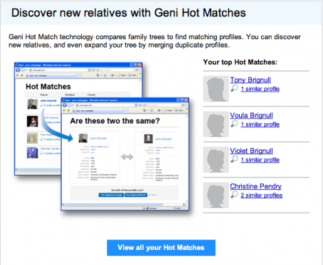
Above you can see a screengrab from a recent geni.com email campaign. “Discover new relatives with Geni hot matches” – sounds pretty cool. Let’s see what happens when you click through.

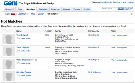
After you’ve taken the trouble to log-in, you end up on this page. This is pretty tantalising – it’s possible that within a few seconds you’ll see entire new branches of your family tree, perhaps even new lines of ancestry. You’d be foolish not proceed by clicking on one of the “similar profile” links.

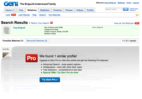
What’s this? Most of the information here seems redundant – but hang on, it’s mentioning words like “Pro”, “Special Offer” and “Try for free”. That doesn’t sound good. Let’s see what happens when we click “Try Geni Pro”

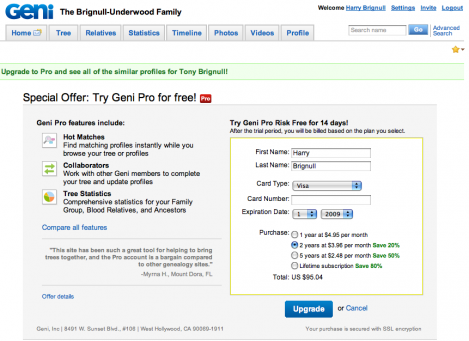
A collective scream of frustration “Argh! A credit card form! And it wants almost $100!”. Users are likely to feel manipulated and annoyed. The key point here is that users would have reacted differently if they were presented this information upfront – the problem lies in the order of presentation. With the right sales pitch, it could have come across as a great deal.