Bryan and Jeffrey Eisenberg pack a lot of theory about the psychology of persuasion into the concept of a “call-to-action”, but at its simplest, a call-to-action is the area on a page that sums up its main purpose or goal – i.e. the bit that the designer wants the user to read and click on. A good call-to-action is one that’s rapidly noticed and easily comprehended. A bad one… Well, just take a look below. It’s rare to find a site that makes the same fundamental mistake over and over again like this.
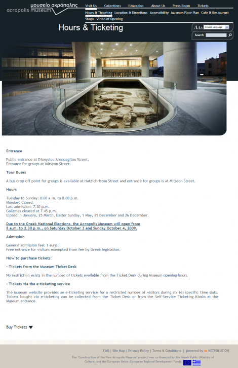
Above is a screengrab from theacropolismuseum.gr, the site for the new Acropolis museum in Athens. It opened this year, and it’s turned out to be a very popular tourist attraction. With that in mind, it makes sense to book your tickets in advance. It’s not too hard to find this page (Hours & Ticketing), but the next step is to enter the ticket booking process. So, how do you do that? It’s almost like they’ve hidden the “Buy Tickets” call-to-action on purpose, as a nondescript link right at the bottom of the page. This is the online equivalent of designing a supermarket with the tills hidden in the stockroom – hardly the definition of good business sense.
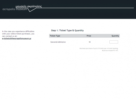
Having clicked ‘Buy Tickets’, the user ends up here (above), which seems to be the first page of the booking process. The only thing we can see here is a text field. Where’s the rest of the stuff? Where’s the ‘next’ button? Where’s the steps-left indicator? It almost looks broken – as if the page hasn’t loaded properly. In fact, to proceed to the next step the user needs to enter a number into the text field, and then the next chunk of the form will suddenly be revealed. You can almost picture the user muttering to themselves – “Why on earth does this site have to work differently to the rest of the web?”
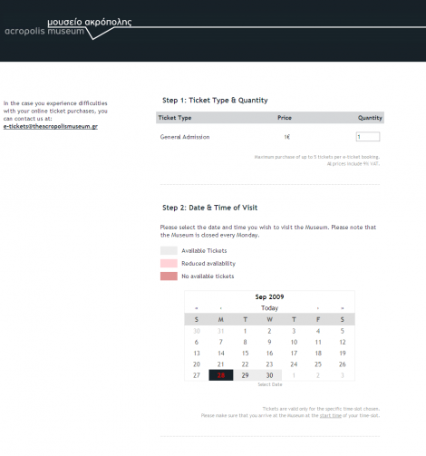
Having entered the number of tickets, this calendar widget appears (above). Today’s date is currently selected. What are you expected to do now? Once again, there is no clear call-to-action. In fact, you have to click any date in the future and it will reveal which times are available.
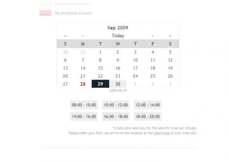
Phew! If the user’s got this far, they are probably getting the hang of this unconventional UI. They need to click on their desired timeslot to proceed, then they need to fill in their address, payment details and finally they reach a confirmation page, shown below.
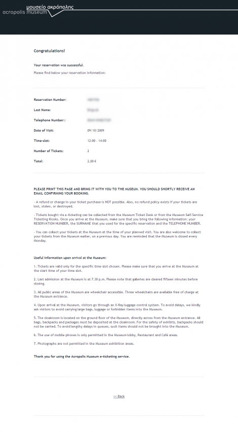
Here’s the confirmation page. The user will expect this to be emailed to them – that’s normal practice, right? Not on this site. If they don’t save or print this page, they are going to have real trouble getting into the museum. This key instruction is written half-way down the page, but once again the designers have made the same mistake of providing a weak, easily missable call-to-action.
To sum up, I’m hoping that this example has given you a reminder about the crucial importance of strong calls-to-action. It’s obvious stuff really, but we all make schoolboy errors from time to time.
Good example of form over function. They’ve tried to make it too slick and in the process damaged the ux. Would be interesting to see how users got in with this in testing (if it ever was tested).
Why the silly progressive disclosure on the ticketing page? It’s actually LESS work for them to just show the lot without JS wizardry.
Confused about the lack of email confirmation – does it actually not send one at all, despite claiming to do so?
It sends you an email with the credit card receipt info – from the payment provider – but without your museum ticket number.
It’s nice how you made smaller preview images of these screens for your post above. While glancing at each image, it was hard to tell if there was a CTA or what the page is even for. I had to read your paragraphs for an explanation of each page.
Probably not good.
Confirmation page looked ok until I read your bit about no confirmation email… Sheesh!
On the whole I think this was a bad example to pick on, it has so many issues on every aspect of design, usability, accessibility…you name it, it’s done it wrong, so to expect a decent call to action is stretching the boat a bit ;-)
For a good LOL moment, try entering a quantity more than 5 on the step 1 form :o)
I suppose it was a bit of a cheap shot, but I’ve yet to see a clearer example of how not to do it…
I happened to stumble upon your website from one of the tweets from my contacts. I would like to tell you that you have got a very informative website. Or to be more precise, a thought provoking website which specializes in UI experience. I haven’t seen such a quality website on UI design until I saw your blog. Good work.
Coming to the article that you wrote. The design and user experience was really poor in the Athens museum website. Like you said, we make schoolboy errors time to time. I guess the reason for this could be lack of experience or lack of passion to create something useful. If you hire a bunch of cheap programmers and force them to finish a task, this is what you get.
Great review. Looking forward for more quality articles such as this.