Browser malware warning pages are tricky things to design. Users are a lazy bunch (productively lazy, that is), and they are unlikely to read the text in every single dialog box you put in front of their faces. They’re much more likely to steam through and click on whatever looks most like a “proceed” button – if they do this on a browser malware warning page, they’re in deep trouble. As a result, browser designers employ various techniques to prevent this from happening.
Firefox 3.5.1 Malware Warning Interstitial:

I really like the way the designers of Firefox have approached this problem – they’ve provided a strong emphasis on the non-catastrophic buttons, and they’ve shrunk the “ignore this warning” link so it’s barely even visible, tucking it away to the side so it’s highly unlikely to be clicked by mistake.
Chrome 2.0.1 Malware Warning Interstitial:

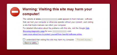
The designers of Chrome employ a technique normally used for Terms & Conditions. The user has to tick a checkbox, then click “proceed anyway”. This works just fine but it doesn’t have the elegant simplicity of the Firefox approach.
Safari 4.0.2 Malware Warning Interstitial:
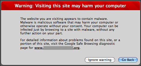
Do you notice anything wrong with Safari’s implementation? A hurried user can easily click “Ignore warning” without realizing what they are doing. Being the biggest button on the page, it almost looks like the designers want users to click on it – the exact opposite to the approach used in Firefox. Even though “Go back” is highlighted as the default option, this a very weak effort to prevent users from getting their computers infected with malware.
So there you go. Three different browsers, three different approaches, and for once the Apple example is by far the worst :-).
glad you put this together. completely agree with your assessment on the buttons and prominent text.
any thoughts on the colors they’ve used (maroonish background + white foreground)? it actually makes the text difficult to read.
What a super review. Nuff said.
R! :-)