Earlier this month, Carsten Schmitt & Poppy James of Bunnyfoot gave an Eye-Tracking demo at UX Brighton. People have been asking us for some of the heatmaps that were generated during the demo, so here they are.
Before you look at them, a word of warning: these heatmaps are entirely inconclusive and non-scientific. They are the result of a small handful of people trying out an Eye-Tracker in a noisy environment. The purpose of showing them here is to raise questions rather than answer them.
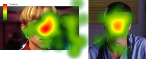
Clooney or Crook: which one do people prefer?

Judging from the heatmaps, which actor do you think was preferred by our 9 volunteers? Handsome Clooney or strange looking Crook? Actually, it’s a trick question. Eye-Tracking heatmaps only tell you where your participants fixate – they do not tell you what they are thinking. This has very important implications for when you use Eye-Tracking on your own sites. If you notice a hotspot (i.e. gaze fixations) on a certain area of a homepage, you don’t know whether this is because users are understanding it and lapping it up, or whether they are thinking “What the hell does that mean, I’d better read that again!” For this very reason, eye-tracking studies are normally paired with an analysis of the user’s behaviour and some form of retrospective think-aloud (in which the user tells the researcher what they were thinking during the test). This data is crucial in explaining what the heatmaps actually mean.
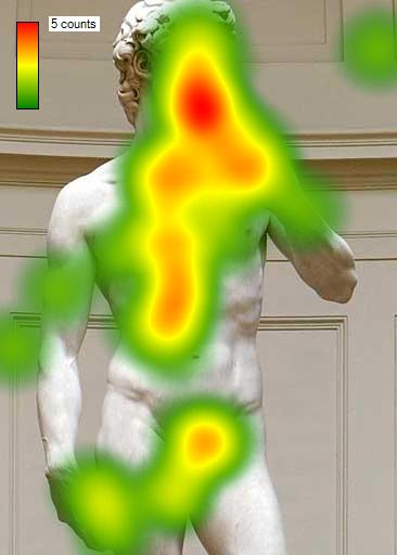
As you can see above, people almost always focus in on faces, breasts and genital areas. This is common knowledge and often exploited by advertisers, but what’s interesting is that it seems to have nothing to do with sexual orientation – in our little test, even the straightest male participant couldn’t help but cop a quick look at David’s manhood.
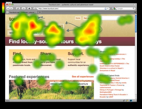
Moving on to something less frivolous, here’s a heatmap from Cennydd Bowles’s Tourdust. If you take a look at the live site, you’ll see that he’s employed a JavaScript progressive disclosure technique to hide/reveal the site’s faceted navigation system. While usefully compact, the risk with such an approach is that users might not notice the call-to-action. To counter this, he’s added an instruction on the right that reads “Click these to find what you’re looking for”. Judging from the heatmap above it seems to have been effective.
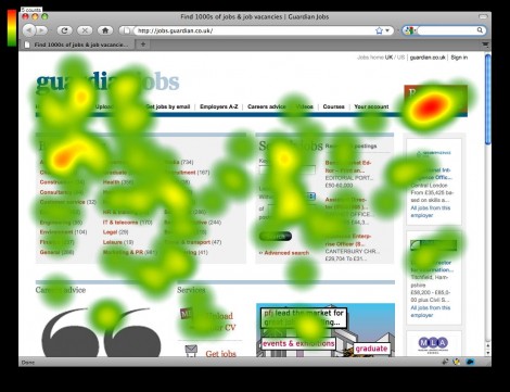
Above you can see a heatmap of Guardian Jobs. There’s a hotspot at the top right-hand side, relating to an eye-catching orange rectangle that reads “Recruiters, post your jobs online”. It’s worth noting that this works because it’s the only such element on the page. Repeat this trick too many times, and you’d create visual clutter with too many brash elements vying for the user’s attention.
So, that’s all I’ve got for you today. Hopefully you found that interesting, even though it was inherently inconclusive. By the way, if you fancy getting an eye tracker of your own, you should start saving up now – Tobii Eye-Trackers weigh in at roughly $35,000 [PDF] for a high end model.


It would be interesting to see the results of this eye test with pictures voluptuous women. I am sure the heat maps would show the most red in the appropriate places. Women deal with on a daily basis :), but this is a cool piece of technology.
Pingback: Cheap Eye-Tracking Solutions? « The User Experience
Pingback: Conversion Rate Optimization (CRO) Techniques: The Complete List
Pingback: Conversion Rate Optimization (CRO) Techniques: The Complete List | RedOnion