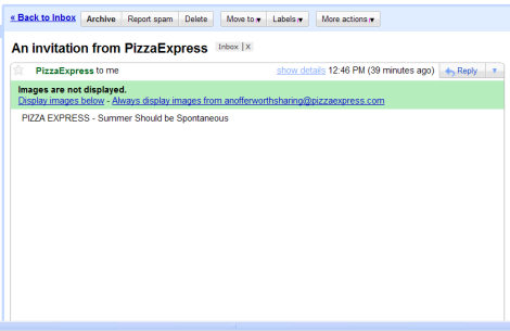
Why do people do this? This email is the final step of an otherwise great marketing campaign. I’m not singling these guys out, it’s a common mistake that everyone seems to make. This email template relies entirely on images, but since most email clients have images turned off by default, the email falls flat. What’s enticing about the email shown above? What would drive a user to do turn the images on? Not much.
The lesson here is a simple one: images in email should be treated as progressive enhancements. In other words, emails should be perfectly readable and enticing with the images turned off – and they should be even better with them turned on. Simple, really.

Not necessarily true all the time. If a brand (such as Asos) has built expectations of sending high quality emails that are based solely on graphics, then users will display.
Of course, it depends on the list and the creative, and it takes a lot of testing, but it can work.
Very true. Some marketing emails are all about the images (clothing ecommerce is a good example). However, even if the brand is trusted by the user, some persuasive textual content is needed to entice the user to click. Standard consumer decision making stuff, really.
Is this particular email just one giant image? I agree with you… there should be a certain amount of styled text that displays by default.
At least they filled in a relevant ALT attribute…
I forgot to mention: the email is all about a new 2-4-1 deal. It’s a really good offer! No mention of it, though, in the subject line, in the alt tag(s) or in any text above the fold. What’s interesting is not the fact that they made an obvious mistake, but the fact that it’s so common. I guess marketing emails aren’t quite sexy enough to warrant the attention they deserve?
I’m not saying it’s right but I know why they do it.
There are so many different mail clients and they are notoriusly bad at rendering HTML and particularly CSS properly. They only way to get consistent results and retain complete control over the layout is to use a big image.
Also, you only have to tell the email client to display the images once and it will always display them for that merchant.
I agree it’s not ideal though.
Jon – it depends on your email client whether it displays images one-time or forever when you click “display images” (or equivalent). For example, Gmail has two actions: “Display images below” and “Always display images from xxx@xxx.com“. My point is that even if users only have to click once, this is still something they have to be motivated to do. Without adequate enticement, some will drop out. This is a needless leak.
In this case, it might not work, but there are a few examples of image-only emails that get good results. Why? Because readers trust the brand enough that they know turning on images will be worth it. Asos in the UK are the oft-quoted example.
Good article from Alchemy Worx here:
http://www.alchemyworx.com/alchemy_worx/2009/newsletter/issue7/lp/lp3_email_design_images.html
That Alchemyworx article is good, thanks Dan! Still, looking at their examples, I’d put money on ASOS being able to get an uplift in conversion rates by using an approach more like LoveFilm. Are you on ASOS mailing list? If their emails always tend to be very similar, then that’s an indicator that they aren’t doing any multivariate testing on their marketing emails. Their loss.
Pingback: Plug-it design » Using images as progressive enhancements