When you start your own company, there are lots of small decisions that you need to make. What do you splash out on, and what do you pinch pennies on? It’s tricky to decide.
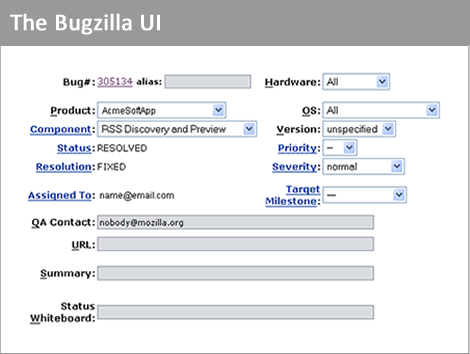
One of the common ways to reduce your initial outlay is to opt for free or low cost software if you can get away with it. For example, maybe you’d consider using a bug tracker like Sifter or Jira, but you’d finally opt for Bugzilla. It’s not pretty, but it’s free – and it has all the features you need.

With a cluttered, unintuitive UI, Bugzilla has a learning curve – but it’s not insurmountable. Plenty of companies use it.
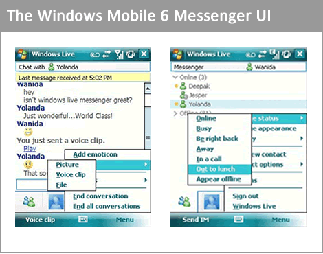
Next on the list for your company is mobile phones. iPhones would be nice, but they’re too expensive. Better to opt for last year’s Windows Mobile handsets, the ones that come free with the contract. You can’t argue with free.

Older versions of Windows Mobile have been widely criticised for poor usability and “toothpick” interaction style, but what the hell – lots of people have learned to live with it. It packs a lot of features in for the price, that’s for sure.
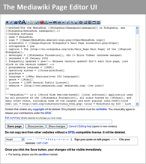
What’s next on the list, then? What about a wiki? Knowledge management is, after all, pretty important. Maybe you could use Confluence or PBworks – they are nicely crafted packages, and not too expensive either. But hey, there are plenty of free solutions out there, like Mediawiki.

Mediawiki may have an interface that only its mother could love, but if it’s good enough for Wikipedia, it’s got to be doing something right.
But let’s stop and think for a moment. Everyone in your company will spend most of their days looking at this software. They’ll probably spend more time looking at these UIs than they spend looking at the faces of their loved ones. Without realising it, you’ve set a standard. You’ve taught everyone in your company that UIs like this are ‘normal’, and are the right way of doing things. When someone needs to design a new advanced search UI, what do they think of immediately? Why, Bugzilla of course. That’s a typical advanced search UI – everyone knows how to use it, right?
Wrong. That’s the classic egocentric fallacy in action, the lynchpin of all bad design: “Other people see the world how I see it, and think how I think. Therefore if I find it easy to use, everyone should be able to.” According to Piaget, humans grow out of this phase at age 7. If only that were true!
You can’t expect all of your staff to be great UI designers. But if you surround them with great UIs, you improve their ability to discern quality, to recognise bad design, and to point the finger and say ‘this doesn’t seem right’.
There are lots of good reasons to use free software, and many more reasons to use open source. Raising the bar for your own UI design is rarely one of them.
Hi. This is a really interesting article – it got me thinking about the sites and applications I spend my days looking at. At work I have a fairly ugly Sharepoint setup (designed with budget in mind) so I totally see where you’re going with this. I think that over time open source has evolved to have a larger focus on the UI (with Firefox being a good example). Perhaps there should be more of an emphasis on getting open source software using companies to add their own enhancements back into the pool so that others can benefit. I know that this is a very idealist point of view but it’s something to aim for at least.
Thanks.
Hi Jono, thanks for taking the time to comment. I’d consider Firefox to be a pretty special case since they have a healthy revenue stream, but yeah, you’re right. Firefox is a nice example of how things are changing in the world of open source. The whole philosophy of add-ons and user scripts works extremely well (Counterstrike Mods also jump to mind as an example from the world of gaming). Definitely a useful social design pattern.
I agree, but at the same time I’d say that this isn’t exclusive to free/open source software, which your inclusion of Windows Mobile shows. Commercial software do tend to be more polished interface wise, but there’s no lack of bad interfaces among high ticket applications: for instance, look at SAP or Lotus Notes; in fact, almost anything labelled “enterprise”.
Open source tends to be written by programmers for programmers, and unless you’re in that target group they tend to be inscrutable. (I cringe every time I have to use Bugzilla.) But most commercial applications aren’t much better in this regard, since they’re usually written to cram in as many features as possible and for the sales department, rather than for the intended users.
I think part of the problem is the more general case – developers are typically surrounded by technical interfaces (command line interfaces, code, developer tools, and so on), which makes them lean towards creating those kinds of UI:s. Add to this the fact that good user interfaces tend to get invisible in use, and you have the recipe for choosing the option that’s easiest to implement and regarding things like autocompletion and keyboard shortcuts as frivolities, since they require more work. (I wish I knew how to turn off autocompletion in Outlook to make this point more clear to people.)
BTW, I think you should add some indication of required fields to this comment form.
As I sit here using Firefox and WordPress, to write this, it’s evident that ‘free’ software can often have better UIs that their pay counterparts. However, UI design is always going to be time consuming and effortful. A revenue stream and financial backing makes this a lot more palatable. (The Mozilla Foundation and Automattic are good examples – the consumer doesn’t pay, but they both have money coming in).
I guess my underlying point is that if you surround yourself with certain kinds of UI design patterns, they will start appearing in your own work if you’re not careful.
That I definitely agree about.
I think my main quibble was singling out open source, but maybe I’m extra touchy about this since I work with enterprise software every day, and find no lack of crap interfaces there.
Hallelujah! Agree 100%.
Might be being a bit harsh here, but the problem is once your QA dept. have seen the 3000+ features that have been squeezed into that fugly BugZilla UI they’ve made the mental decision that this is powerful software & what they need as power users.
Good looking apps like Sifter, which probably does everything they need are dismissed as being too simple & inferior.
(P.S. Harry – you need to make this textarea bigger!)
Just noticed this so I thought I would share: prototype UI changes for the Wikipedia… http://usability.wikimedia.org/wiki/Designs
Pingback: Our Bookmarks: Jun 08 - Jun 14, 2009