Registration and log-in areas have been a common feature on the web since – well – since forever really. With this in mind, it’s amazing how many top name sites deliver frustrating registration and log-in experiences that not only annoy their users, but also impact their conversion rates and chip away at their profitability. This post highlights five User Experience (UX) antipatterns, and explains how you can avoid them in your own designs.
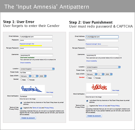
Example: youtube.com
Problem: the user fills in the registration form, but makes a few errors. Upon submitting, they not only get an error message but also find their chosen password has been wiped out. So they have to enter it again, and perhaps even a third time if they are unlucky. They get pissed off and a small but notable proportion of them give up.
Solution: where possible, use JavaScript validation to ensure fields have been completed correctly – this avoids the password fields being wiped out. Another common mistake is to forget the user’s email address between the log-in and ‘forgotten password’ page. It’s rude to make users repeat themselves, whatever the context.
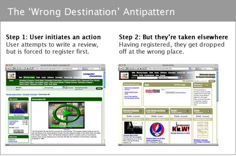
Example: Archive.org
Problem: when a new user finds a video that they want to comment on, they are required to register. Upon completion of the registration process, where do you think the site drops them off? At the video they wanted to comment on? No – instead the user is taken back to the home page, so if they want to add their comment they then need to search for the video by hand. By this time, a proportion of users will have lost interest or forgotten what they set out to do. It isn’t a catastrophic failure – but it’s a failure all the same, and if you make this mistake for revenue-critical user journeys, you will pay the price.
Solution: always keep track of any activity the user sets out to do, and pipeline them back into it when they complete log-in or registration. This keeps them focused and will reduce drop out.
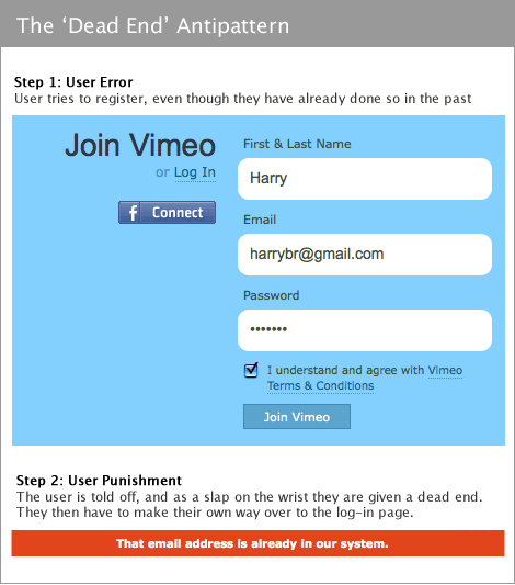
Example: Vimeo.com
Problem: users sometimes attempt to register without realising they already have an account with your site. It’s easiest for developers to just give them an error message, and leave the user to make their own way to the correct form. Vimeo, for example, does exactly this. Again, this isn’t a catastrophic failure. but it’s careless and shows little consideration for your users.
Solution: it’s unkind to leave them in a dead end with only an error message for guidance – it’s much more helpful to reroute them automatically, or at least give them a prominent link through to the log-in area. (Caveat: some large sites are attacked so relentlessly that they will not divulge whether a username is valid, since this is useful information for attackers. However, the risk is mitigated through the use of failed log-in throttling).
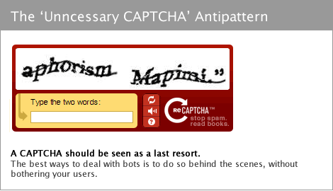
Problem: the user has difficulty reading the text in the CAPTCHA. They often have to try more than once, causing frustration and increasing the drop out rate. For example, Sampa.com reported that they achieved a 10% uplift in conversion rates by removing CAPTCHAs. That’s money on the table.
Solution: a CAPTCHA should be a last resort, having tried other alternatives. For example you can use a honeypot technique, that uses a form field that’s invisible to a user but visible to a bot – if it gets filled in, you know it’s not from a human. Or you can experiment with softer CAPTCHAs like riddles or simple math problems. The best tactic is to start as soft as possible, and only ramp up if bots become a real problem.
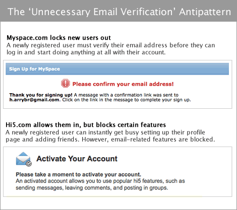
Problem: an email verification barrier is a way of confirming that the user attempting to register does in fact own the email address they are registering with. It works by sending the user an email containing a link, that they must then click. On many sites, if the user does not do this, they aren’t allowed to log in, and are left standing out in the cold. Some users can’t find the message in their inbox, and others get side-tracked when they see other unread emails. By encouraging them to leave your site, you open the door for many uncontrollable factors.
Solution: the real question you should consider is whether you really need an email verification step, and if you do, where it needs to live. Although I’ve named myspace as an offender, they do have to deal with epic proportions of spam, so they at least have an excuse. Hi5, though, being the underdog, are working far harder to build their userbase. It is rarely necessary to lock your users out completely. It’s far more effective to let them in, but block them from doing the one or two things that genuinely need email verification. For example, let them log in, but don’t start sending them loads of emails until they’ve verified that they do indeed own that email address (this ensures your email server doesn’t get a punitive spam score). Similarly, if you have any private information about that email address, don’t reveal it to them until you are sure they are who they claim to be.
Lazy Registration
It almost goes without saying, but one approach that often delivers an excellent user experience is to remove the registration barrier entirely and opt for a lazy registration model. You can find out more about this in the lazy registration demo that I posted last month.
Security vs. User Experience
I have to finish this post with a big caveat about security. There’s always going to be a tension between security and usability – in fact, when you notice a UX antipattern somewhere, it’s probably the result of an enthusiastic security policy. If you’re lucky enough to have a very successful site, you may find it becomes the target of specific and sustained attacks. If that happens, you may have to batten down the hatches and ignore some of the recommendations in this post, such as adding CAPTCHAs regardless of the usability implications. However, if you’re really smart, you’ll find a way to deal with bots and provide a great user experience at the same time.
Other resources:
- Registration design patterns on Konigi.
- Sign up and ramp up design patterns from Adaptive Path.
- Sign up forms must die – Luke Wrobleski’s ALA article
- Lazy Registration Demo Screencast of the Madgex Job Board platform
Great post. Succinct and nicely illustrated.
Neat! And very timely for my current endeavour, tnx.
Really nice, concrete examples, and easy fixes for the most part. I’m always railing against CAPTCHA – too many people use it to save themselves minor inconvenience, and end up putting all of that trouble on their customers instead.
Great article. I hope more sites pay attention.
Nice article, though I can’t say I agree 100% with the “unnecessary email verification” pattern.
You can include some instructions on the registration confirmation page that indicates to the user to check their junk/spam folder for the email if they can’t find it in their inbox. This of course assumes users will read the message.
Thanks for the information in this post. We are constantly striving to find good resources for well thought out UX strategy and this blog is definitely on the list. Also glad you saw value in the honeypot technique. We found out about it recently and it works great, not sure why it fell out of favor. Keep up the good work!
@cancelbubble – I knew I didn’t get the name of the email verification antipattern quite right… I should have probably called it ‘poorly considered email verification step’, but that’s a bit too wordy :-)
On cancelbubble.com you have a strong motivation to prevent users from gaming the system – right now you have an email verification ‘blocker’ which prevents this casual activity (but not a dedicated attack). However, it will also negatively impact the number of completed registrations by some degree. You might want to consider new creative ways to allow people to ‘bubble up’ (digg) items without requiring them to activate first.
Pingback: Wayne State Web Communications Blog » Blog Archive » [Friday Links] The … Edition
I’ll ditto the “Unnecessary CAPTCHA” anti-pattern and argue that it’s always unnecessary. ;)
Other research supports the result Sampa.com saw with their 10% boost in conversion rates. The University of Washington completed a study in December that found a little more than 10% of users were never able to complete several different types of CAPTCHAs presented to them (even after more than 3 tries). Among our clients who’ve dropped CAPTCHA in favor of Form Armor, we’ve consistently seen an increase of 9-12% in conversion rates, too.
Thanks for a great article!
Hi Larissa, do you have the URL for that Washington paper? Thanks for pointing me to formarmour.com, it looks like it could be a real success, good luck with that!
Hi Harry, thanks for the Form Armor kudos. Always appreciated!
Here’s the link to the University of Washington study (it’s a PDF file)
http://webinsight.cs.washington.edu/papers/captchachi.pdf
Pingback: links for 2009-07-17 | burningCat
Pingback: links for 2009-07-29 « pabloidz
Nice post, Harry, thanx! Already retweeted it.
Pingback: Enquiring Minds Want to Know » Blog Archive » Interesting links for December 15th
Here’s one thing a lot of people don’t do if you’re not using captcha:
Make sure that the script that is sending the POST is the same script of the form and that it is localized to the application.
Check the URL and the IP.
This can be spoofed to a certain degree, but it does work. Not foolproof, of course, but it does reduce all the garbage spam scripts out there to a manageable sum.
E-mail verification as a spam prevention method isn’t reliable as It’s very, very easy to create hundreds of actual but otherwise worthless email accounts using similar scripts on the spambot side. Contributing to the spambot’s efforts are sites like aol, hotmail and 10minutemail.com which make creation of temporary email accounts very easy for them. Developers should not think e-mail verification is any panacea.
Alternatively I do like the Javascript checkbox and honeypot using a non-hidden yet-offscreen field methods with the automated field renaming obfuscator.
Pingback: 10 tips for a better login page and process - UX for the masses