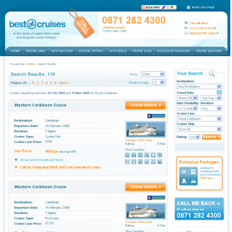
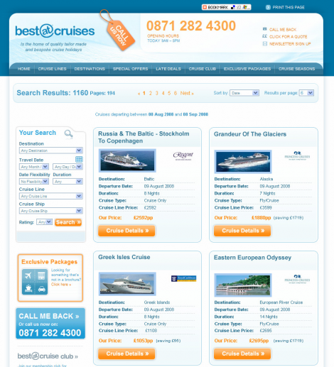
There was about 120 respondents for last weeks quiz (Which of these search results pages perform best?) – not a bad turn out. What’s interesting is that quite a number of you were wrong, wrong, wrong! This is a perfect example of why expertise always has to be balanced with user research.
Design A was the winner on both counts. In fact, design B was actually the original design from before the research, and design A was the optimised outcome (see below for screen grabs).
- Design A resulted in 23% more visitors reaching a cruise details page. (36% of you pollsters were wrong about this!)
- Design A resulted in an uplift in sales (figure not stated)
- Design A resulted in callback requests increasing by 9% (60% of you pollsters were wrong about this too!)
If you’re like me, you’ll probably be wondering about the statistical significance of these percentages. Unfortunately this information wasn’t in the press release. Still, it’s interesting food for thought!
Amendment: Alasdair Bailey of Maxymiser responds: “Usually, we recommend that clients wait until confidence is above 85% or perhaps slightly lower with a high level of ‘stability’. Most clients are happy to make a call at that sort of level although some hold on until the 90% – 99% range.”
Many thanks to Maxymiser for releasing the details of this study!


of course…I could have predicted those results (not to the percentage, but in terms of overall performance) just by looking at the two designs. B is disjointed, noisy and difficult to read. A is concise and follows good design principles that allow for quick visual “grasp” of information. I would never have designed B in the first place.
What I find interesting is that much of what researchers spend their time trying to prove have been worked out through thousands of years of information and visual design practice across hundreds of cultures.
I am reminded of the way in which architecture and art were taught at the École des Beaux-Arts in Paris in the 19th century. If you wanted to be an architect or a painter or a sculptor…you spent years studying the masters and inventing nothing until you understood the cumulative knowledge and practice of your craft. This meant you had a platform of knowledge and practice that gave you the freedom (and skill) to deviate from or build upon that older knowledge.
The reason so much research is needed these days to solve these sorts of problems is that few people genuinely spend any time learning what is already known…much less practicing their craft. So they reinvent the wheel over and over…and then need research to prove what is already knowable through practice.
Its not as if the problems we are trying to solve on the web are new…try designing the cockpit of a fighter jet…or perhaps the layout of a store…the design principles with respect to how people behave and make decisions in each case apply to this example…so knowing those things, A (and minor variations of A) would have been the only option designed in the first place.
The real question is between versions of A, which performs better…because that is where the subtleties of things are revealed by research and it becomes useful as a tool. But solving these kinds of obvious problems seems a waste of time, frankly. But then what does a crusty old designer know anyway?
I wonder if culture has an impact. In the UK we read time tables top to bottom, but in the rest of the world we read left to right, or right to left if you are Arabic.
For more on culture and usability I have bloged about it here
http://blog.feralabs.com/2009/01/does-culture-effect-online-behaviour/
I’m not surprised That design A got more clickthroughs to the item page. The “cruise details” button is in a much more obvious place.
However, the other reason is probably that the page provides less information about the cruise, so the user is made to hunt for the information by visiting the item page.
Annoying for the user, but obviously resulted in increased sales!
I’m quite chuffed with this one given my poor showing on the Laura Ashley game. I’m not sure that callback measurement is very safe to be fair. If you’ve improved the results page that should flow through to increased enquiries, regardless of what happens with the callback message.
I think this is a good example of how expert opinion is used badly. If you want to compare two designs, a usability expert can point out problems in both but will often struggle to point out which is best (unless the difference is massive). It doesn’t stop many of us selling our services for this very purpose though.
Jon your argument is a little flawed here. How do you know its not enough information?
Perhaps its enough to decide which one they want to know more about.
In any case I think it’s a bit of a stretch of the imagination to say it’s annoying to the user.