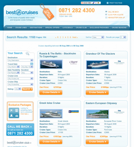
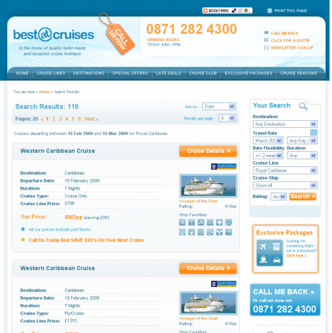
Here’s another press release turned quiz from Maxymiser. Which one of the designs below do you think got the highest number of clickthroughs to an item detail page? And which one do you think got the highest number of ‘call me back’ requests?
Amendment: scroll down the bottom to participate in the poll! (All will be revealed next week)

Design A: grid layout with search controls & upsells on left

Design B: vertical layout with search controls & upsells on right
I would say Design B. That ‘feels’ more like search results, plus it has more browsing info like the icons on Ship facilities.
Design A just doesn’t look like a search results page to me.
Do we get a prize for this? ;-)
Hm…
Clickthroughs to item detail page: A
Call me back requests: B
A got more clickthroughs simply because the more info button is more obvious.
B got more Call Me Backs because conversely the more info button isn’t obviously positioned and seems somewhat disjointed from the rest of the search result, so the next action would be Call Me Back.
HOWEVER,
A might have gotten more Call Me Backs simply because it falls in the visual eye flow.
I tried clicking on both, and neither did anything.
;)
I agree with Jon:
Clickthroughs to item detail page: A
Call me back requests: B
Although I think it would be good to see full length screenshots in order to get an impression of how the page looks when scrolled down.
Well done for making this a quiz by the way :)
Well Danny, it was your idea!
:)
I’m desperate to redeem myself from the last time. I’m guessing A for the first one because the cruise details are dicplayed a lot simpler, the button is below and close to the image.
I’m guessing B for the second one purely because there is less overall detail on the page and the number is very close to one of the images.
Pingback: And the winner was… - 90 Percent of Everything
Thanks everyone for having the guts to state your opinions and justifications. As it happens, design A won on both counts.
Read more about it here.
I wish I had seen this in time to vote before the announced results! I was leaning A on both counts (though published results cast doubt on anyone’s “perfect score” claims), but for different reasons than the results page suggest. I theorized that better overall usibility would improve all actions the site seeks to elicit. From this perspective, I noticed that the search refinement area was on opposite sides and reasoned that (at least for right-to-left language readers such as English used in the images) users encountering the filters first (Left) would tend to refine their results immediately if useful. Consequently, they would see more “interesting” options listed sooner than those who encounter the unfiltered results first. The latter group (without strong visual cues to draw their attention out of the natural reading flow and edit the filters) would often have to track relevence mentally which should produce higher pre-completion user attrition than the first group.
I didn’t see the details of the study (the link points only to the tester’s homepage), so I thought my reasoning might be of interest since it led to the same results testing observed.