For those of you who don’t know the US cultural reference, the Roach Motel is a cockroach trap. Essentially just a small cardboard box with sticky paper inside, Roach Motels were made famous by Muhammad Ali, who at the tail end of his career was hired in as the product spokesman. Interesting choice.
“Roaches check in, but they don’t check out”, as the saying goes. While this might be a passable way of getting rid of cockroaches, it’s a terrible way to treat your website visitors, yet it’s very common to see this pattern in email service subscription UIs.
Lets look at the steps required to sign up to an email service on a typical site:
- User clicks on the ‘subscribe’ link
- They then register, entering their email address
- Then enter a new password
- Then enter it a second time in the ‘repeat password’ field
- And finally, they submit the form and subscribe to the service
So, that’s 5 or so steps, and each of those are pretty low effort. While it is annoying to be forced to create an account, there’s no serious brainstrain going on yet. Now, lets imagine a couple of weeks have passed and the user is getting fed up with the emails they are receiving. What steps are involved in unsubscribing from the same service?
- User clicks on the ‘unsubscribe’ link
- They then have to log-in. They enter their email address
- Then they hesitate at the password field, wondering “Which of my passwords was it?”
- So, they try at a password, and hit submit
- Error feedback comes back showing that they got the password wrong
- They click on the forgotten password link
- The form asks them to enter their email address again
- They fill in the form, and hit submit
- They switch to their email account, and wait a minute or two for the email to arrive
- Some users at this point also have to check their junk mail folder, while others will be sidetracked by important new emails in their inbox
- Finally, the email arrives, they open it and click on the “reset password” link
- They choose a new password, repeat it and submit the form
- And finally, they are able to unsubscribe from the email service
On the unsubscribe journey, we’ve got 13 or so time-consuming steps, and some of them are deeply frustrating. When you look at it like this, it’s obvious that it’s a catastrophically awful user experience.
What’s a user to do?

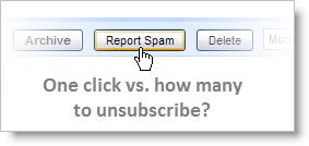
To avoid jumping through all those hoops, the Report Spam button must feel pretty alluring. And if users start clicking it en mass, you’re in big trouble. Google doesn’t discourage this, to quote from the Official Gmail blog: “…if you didn’t ask for it and you don’t want it, it’s spam to you, and it should be reported. We’ll sort it out on our side.”
When a customer wants to leave, it’s crucial that you allow them to do so in a pleasant way. When frustrated customers leave, they don’t come back.
I guess I'm a corporate altruist because whenever I see something that I subscribed to (or even something legitimate that may have gotten my email from another site I belong to), I'll mark it as 'not spam' and remove myself the old fashioned way. I just worry about the reliability of the spam system if things like Sierra Club mailings become marked as spam.
Most of the time I'd say it's not as complicated as you presented, only a few sites require a password.
You're right, I do present a worst-case scenario, yet one that I constantly find myself in. Some niches tend to engage in this practice more than others. Job boards tend to be offenders, as do estate agent (real estate) sites.
I recently had the pleasure of doing this same horrible routine a couple of months ago I really didn’t know about this until it happen to me. I didn’t know my password so I waited on my old email to receive the email, was a very horrible time consuming experience. I think majority of people dont do this I think most would just click the spam button should be one button process and one page after saying thanks for blah blah and then a small button saying “do you really want to leave?” Thanks for this, a good read.
Pingback: User Interfaces Designed to Trick People | Serving Niches Blog
I agree with the author: unsubscribing should be EASIER than subscribing. That turns the risk to near-zero. Remember AOL (AO-hell)? Trying to cancel their service was like looking for water in the desert.
Put the unsubscribe link at the bottom of every email. DON’T make me enter my email address, password, name or shoe size to unsubscribe. If your system is not capable of embedding my account info in the link, then get a better system.