A few months ago we had Alasdair Bailey of Maxymiser come and visit us at Madgex to give a talk on Multivariate testing.
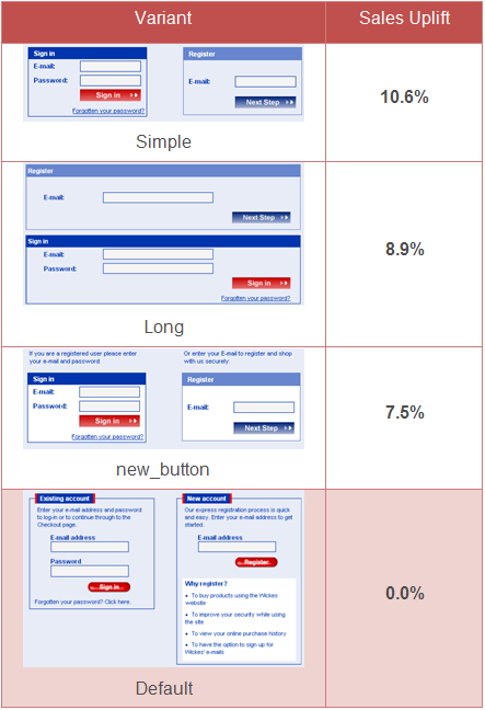
It’s fascinating to hear a specialist in the field of multivariate research talk openly about their findings. What freaks me out slightly is how the performance of a design can be contrary to your expectations. Sometimes seemingly tiny tweaks can have a notable impact. Other times, the untidy looking designs win out over the more modern, aesthetically considered designs. Take a look at the example below from some research they did for wickes.com (Bigger version here [PDF, requires registration]). These are 4 alternative log-in / reg pages that were compared by measuring the number of completed sales that they led to. Would you have expected these pages to perform this way?

Bear in mind that the percentages shown here are percentage uplifts on the conversion rate, rather than the conversion rate itself. For example, if you had a 10% conversion rate and got an uplift of 9%, you’d end up with a conversion rate of 10.9%. There are some more multivariate testing case studies on the Maxymiser website. Try covering up the numbers and seeing if your professional judgement on “good design” is up to scratch.
Incidentally. Maxymiser have their own multivariate testing platform, but if you want to run your own studies, you can always use Google’s free Website Optimizer tool.
Great post. Lately, google has integrated their optimizer tool with the leading open source ecommerce platform named magento. As a multivariate testing provider, this is very interesting thing as well to think about within this space.