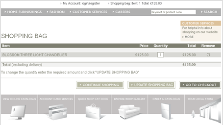
Here’s another Multivariate testing example from our friends at Maxymiser. The performance of each of these shopping basket pages were measured in terms of clickthroughs into the checkout process.
Which do you think performed best? Answers in the comments with your justifications please. If you’re feeling clever, give a rank order of performance too.
Version 1:

Version 2:

Version 3:

Version 4:

Version 5:

Note – I’ve amended this post to make it into a game. If you read the earlier version, no cheating please! ;-)
You should release the data after the image so that we can put our guesses in the comments :)
You’re so right! I’ve amended the post accordingly..
I don’t fee like getting into so many specifics, but here’s my opinion.
I think #5 will probably be the top choice by participants.
Personally I wouldn’t choose any. A combination of aspects from each would be my choice. I don’t like the tiny remove icon, but I also don’t like the plain text link. I’d prefer a more prominent icon or even a button there. I’d left align the the continue shopping button and right align the checkout and update buttons.
Anyway, no one is here to read my opinion.
I’ve been waiting all day for the answer. When is it coming?
At a push I’d say that the versions with the least noise & fewest options are probably the best performers. Less distractions. Something like 5,4,3,2,1?
But… I can see a few problems with ALL of them. Why is the product name always shown in capitals? Capitals are known to have a negative impact on readability.
The update shopping basket button at the bottom of all of them except V3 is visually disconnected from the function it’s meant to perform (updating the total if the user adjusts the quantity). This means users might not be able to work out how to do this, and give up in frustration.
In V3 they seem to try to fix this but use a really big fontsize for no apparent reason.
In V3 they use vile bright green text for the table headings.
It’s almost like the designer was asked to come up with 5 variants but ran out of ideas so they changed some quite superficial things.
Also how about showing the delivery costs upfront to avoid billshock?
Hi Steve, I’m going to leave the ‘game’ open until we get a few more comments, then I’ll reveal the answer in a new post. Give it a few days. Sorry for the wait!
A big link to customer services should be useful for users who have questions about delivery and stuff.
Also it’s good to have a photo of the item to reassure they have selected the right thing.
So I’d say 2,1,5,4,3? Maybe?
Version 4 is best.
I’d guess at version 3 winning. It has the clearest view of the basket and best arrangement of buttons. Moving the less important update button away from the other two simplies the choice for the user, while the ‘go to checkout’ option is clearly highlighted.
V3 or V4 look simplest, so they are probably the winners. I could probably make them even slicker though.
The real question is, what is a better use of time and budget, using a good, iterative design process in the first place? Or rushing ahead with a bunch of lacklustre designs and then using analytics-based testing to sort it out afterwards?
I’ll go for version 4. It’s the only one that allows the user to work out what the delivery charge is going to be before going any further.
You have not answered enough questions, for us to know if the test or the experts in this blog are more accurate. :)
We need to know the expected uplift of the winner, the original conversion rate,how many page views, and the length of the experiment. Was there any control for demographics? Was the experiment measuring the purchase of one product or multiple? Did any of the participants have green/red colour blindness?
J
James, Maxymiser runs on the live site with real customers. So there’s not much arguing about the accuracy of the sample.
Pingback: And the winner was…- 90 Percent of Everything
Pingback: Predicting Performance « Ephram Zerb