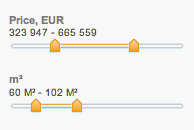
 Ajax Sliders are becoming an ‘in’ tool for filtering search results. They are also quite easy to do wrong if you’re not paying attention to the user experience.
Before you read on, check out Properazzi and try out the price sliders. Properazzi is going to be a fantastic web 2.0 property site, but right now it’s still young (launched in March 07) and suffers from a few UI teething problems.
So, here are three key user experience guidelines you should consider when designing Ajax sliders:
1. Immediacy
- Does your UI react immediately to user input?
- Does it feel fluid or ‘gluey’?
- If it feels gluey’, consider speeding it up by simplifying the feedback – for example just giving users the updated number of results, rather than the full list. See Amazon Diamond Search for an example of this in action.
2. Seamlessness
- Does your UI interrupt the user while they are tweaking the sliders? This should be avoided at all costs.
- If you can’t solve this problem, consider reverting to a form submit button instead of an Ajax approach.
- A good old-fashioned form experience beats a bad Ajax experience every time.
3. Granularity and accuracy
- Does the slider scale offer a sensible scale (max and min) for the context of use?
- Are the slider increments meaningful or abitrary? Realmap provides $50,000 increments, which is all you really need in the context of house-hunting. Properazzi, on the other hand, lets you select to prices to the individual dollar – who really needs to say that they are looking for houses in the price range of £401,768 to £543,312?
Thanks! This is helpful. Are these comments based on any research that you’ve done with users? I’m interested in knowing how much sense the sliders make to most people — that is, do they have a good expectation of how this interface should work when they see it? Is there a learning curve? Do users really LIKE it, or is it just a trendy new possibility?
Hi Chris. I’m afraid these aren’t based on formal user research, they are only based on on an ‘expert evaluation’. However, there’s nothing controversial in there – it’s pretty standard usability fare. The stuff I wrote on viscosity is inspired by Green’s Cognitive Dimensions:
http://en.wikipedia.org/wiki/Cognitive_dimensions
Hope you find it interesting!
Frankly, if it’s about to set some filters, then a form is far better. In both case, the real trick is to provide the relevant values as well as to sanitize the input, if one lets the user type the values, then Ajax is useful to warn in time the user.
your graphic reminded me of my shockwave (yes, shockwave) sliders I built for a web app a few weeks ago:
http://blog.hanfordlemoore.com/2008/01/02/paint-splatter-simulator-for-use-with-photoshop
Pingback: Designing Interaction as a Developer