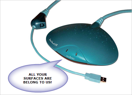
We’ve all had hardware like this in our home: designed to be an ornament yet attractive to nobody, and a waster of good surface space.
You can imagine how the designers pictured it – the user placing the device on a large, minimalist glask desk adorned by nothing but an Apple Mac, an executive pad and a single Cross fountain pen. The user sighs and says, “Wow, that really is a wonderful addition to my home office. Now it has a certain panache, I love it!”
The real world just isn’t like that.
In most homes, the situation is one of managed messiness. There is lots of solid research that indicates that some degree of untidyiness is actually very productive (See “The Social Life of Paper”, a lit review by Malcom Gladwell). When you leave things in an apparent mess, you are often leaving yourself signs and contextual cues of where you were in a particular task and its priority. You also tend to put things in places to remind yourself to do something in a timely and appropriate way. Like leaving letters to post by the front door, or an unpaid bill next to the telephone.
What enables us to do this is the surfaces of our homes. We’ve paid good money for them, and we deserve to pile as much mess on them as we want.
When will technology start getting designed to genuinely fit into our homes and our home lives?
Amen! When I was a teenager, I had a boombox that was nice and rectangular–you could stack things on top of it (including, later on, a CD walkman, since it didn’t have one built in). It also had aux inputs, which hardly any low-end consumer audio devices do anymore.
In retrospect, it was built (intentionally or not) to be expandable and to evolve with its owner. Now you get all this aerodynamic crap that monopolizes all your horizontal surfaces.