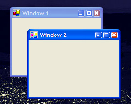
 (That’s windows with a small ‘w’)
Steven Garrity discusses web based applications over at Acts of Volition. The following paragraph caught my eye:
“The browser canvas already lives in a window, often in a tab inside that window. Filling it with another set of windows with a set of behaviour that is similar to, but not exactly like the behaviour of the base operating system windows is likely to create a variety of usability issues.”
He also mentions the One Laptop per Child interface and points out that it does away with overlapping windows.
I’ve felt for a long time that overlapping windows are cumbersome. The amount of time spent rearranging them to keep things visible outweighs the flexibility they provide. I tend to run all my apps full screen and use Alt+Tab or the task bar to cycle between them.
Within an application window the problem arises again. We are mercifully moving away from the days where people thought floating palletes and child windows were a good idea. Microsoft dumped the multiple document interface (MDI) several years ago and Macromedia has dumped floating pallets in favour of docked panels in most of it’s apps and this brings a modest improvement.
I don’t know what the ideal solution is. Tab/taskbar like solutions are better than floating windows and panels are better than floating palettes but only slightly. Maybe web style UI design is leading us to a better paradigm A well designed menu system with breadcrumbs and visual clues as to your current location in the system can feel quite comfortable for some types of application. Whether it can be adapted to tasks that are more complex than Email I can’t say for sure. (isn’t it interesting how web applications are leading us back to something that looks suspiciously like the DOS text-based interfaces that were supposedly made obsolete by GUIs?)
It will interesting to see how the new Office UI is received but that has only really tackled one problem – that of bloated menu’s and toolbars. I think there’s still room for improvement. I don’t think it will be anything radically new and it might even be a simple tweak to ideas that are already staring us in the face.
Can I just add a few bits of information here:
Overlapping Windows
Overlapping windows were originally developed as a response to lack of screen estate. Adobe (/Macromedia) is now able to offer docked panels because developers nowadays usually have such a lot of real estate. Another interesting fact is that On Windows PCs, if you hit the maximise button, it fills the screen. On Macs, The window does not maximise – it always leaves a gutter. This used to bug the crap out of me but there are times when it’s quite useful.
About MDIs.
This is a quote from Wikipedia: “Graphical computer applications with a Multiple Document Interface (MDI) are those whose windows reside under a single parent window […], as opposed to all windows being separate from each other single document interface. […] In the usability community, there has been much debate over which interface type is preferable. […] The disadvantage of MDI usually cited is the lack of information about the currently opened windows: In order to view a list of windows open in MDI applications, the user typically has to select a specific menu (“window list” or something similar), if this option is available at all. With an SDI application, the window manager’s task bar or task manager displays the currently opened windows.”
Alt-tab
One of the reasons people like us like to have keyboard control of our UIs is because we are massive nerds. Normal people aren’t very comfortable with keyboard shortcuts. That’s why Apple’s ‘Exposé’ is neat – it’s a visual, easy alternative to alt-tabbing.
“Overlapping windows were originally developed as a response to lack of screen estate” – I don’t think people *ever* have enough screen space so this will always be a problem needing a solution – I’m not convinced that overlapping windows were ever that good a solution!
Notice that none of the small form factor devices currently taking over the world: phone’s, PDA’s, hand-held consoles and MP3 players have adopted overlapping windows.
In many cases overlapping windows waste more screen space than they gain. If you’re short on screen space you tend to maximize the window so you no longer are working with overlapping windows. If you do as in the case of floating pallettes then the less screen space you have – the more time you waste on juggling the damn windows…
That gap around a maximised window on the Mac drives me mad not just because of wasted space but because when I maximize a window it’s because I want to hide the clutter and focus on the current task. I don’t think I’m going to like Vista’s side panels
This is maybe OT but isn´t the Office suites new menu system just a version of Adobe/Macromedias content sensitive panels? If i choose the air brush tool the panels shows me the options?
Pingback: 90 Percent of Everything » Blog Archive » why splitpane views suck… (but they suck less than other stuff)