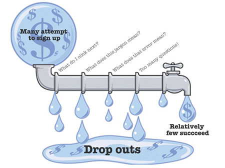
In his recent blog post, Paul Adams got me thinking about metaphors, and how useful they are in explaining usability in a hurry.
A friend recently asked me for some advice to help him “improve” his website. The site involves selling advertising space for employers to post jobs. This is how the conversation went:
Me: “On the jobs page, the search box should be made bigger, since it’s
the site’s main offering”Site owner: “But the search box is right there! How could you miss it?”
Me “Some people will miss it, so they wont get to search, they wont find the jobs that fit their criteria”
Site owner: “That’s just a small visual tweak. How is it going to change anything…? It’s so minor it’s barely worth the effort to change it…”
(Conversation continues like this for 20 minutes)
It’s easy to assume that people you talk to understand usability principles, and you can jump in too deep too quickly. At the time I thought my friend was being very difficult. Actually the fault was all mine. The problem with this conversation was in my assumptions, not his misunderstanding. Whenever you start a conversation about usability, it is always wise to first work out where the other party is coming from.
Usability doesn’t involve hugely complicated concepts (to quote Steve Krug “It’s not rocket surgery”), but if you haven’t spent time thinking and reading about it, usability is something you experience in the “doing”, it’s not something you theorize about. My friend uses his website so often and is so familiar with it that the search box is perfectly prominent for him, and he assumes that it would be for other people too.
About half an hour into the conversation I came up with a metaphor (well, borrowed one) that helped him suddenly understand what usability was all about:
Bad usability is like a leaky pipe.
A large number of potential users go in at the start, but whenever they hit a usability problem, some of them drop out, like small drips out of a leaky pipe. The trouble is that a consistent small drip from a number of places can create huge loss over time.

I know it’s pretty ungroundbreaking as metaphors go, but for getting the point across, it seems to hit the nail on the head. (Image modified from here).
It’s a good metaphor.
The only issue is the “leaks” usually go undetected by the “pipe owner”, so they often can’t tell something is wrong.
Jared
Hi Jared,
Thanks for stopping by and commenting.
A few months ago my next door neighbour (from the flat above me) went on holiday, and left her bath tap dripping. It was a barely noticeable leak, and it somehow missed her bath and went through the floorboards. As a result the ceiling of one room basically fell down.
…Small drips may seem minor – and at first undetectable – but over time they can become a significant force.
Very well illustrated.
I think there would be many more significant “leaks” in the pipe. As Jared quoted, many even go undetected, so how to account for them ??
Any takes on that ..
Yatin.
Harry, give me a clue because that’s what happened to my apartment.
Hi Harry, I just stumbled across this in a image search for a leaky pipe. I was going to use it to create a similar diagram. Thanks for saving me the bother, I’ll just link to this.