At UX Week 2010, Facebook Product Designer Adam Mosseri gave a presentation called Data Informed, Not Data Driven. It’s an excellent talk and Adam gave some really good examples demonstrating how data-driven design can take you into “local maximum”, which is essentially a design cul-de-sac caused by a blinkered over-emphasis on Analytics and MVT. In this situation, no matter how many small metrics-driven improvements you make, you’re unlikely to ever make a big creative leap to a substantially better design. Joshua Porter explains Local Maxima really well in his article The Local Maximum on 52weeksofux.com.

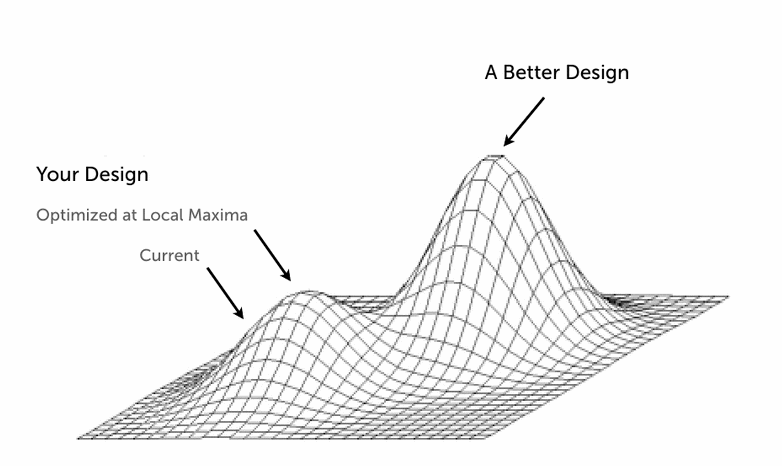
Local Maxima diagram by Joshua Porter
With data-driven design you can end up wasting time trying to reach the peak of the hill on the left, when there is actually a huge mountain of improvement over on the right that you’re not even aware of because it involves a radically different design approach. Let’s look at two real life examples from Facebook. Quoting from Adam Mosseri’s UX Week 2010 presentation:
“…we created a team we called the engagement team, which was tasked with understanding engagement and increasing it significantly […] our first attempt at quantifying engagement was “R.A.W.” – reads and writes. […] Writes are creations of either objects or connections between objects. And reads are what they sound like: reads of that information.
And so we just decided to treat all writes equal and all reads equal, and start to try to optimize for that. We did this over the past few months, and we ended up with products like comment liking. Comment liking is what it sounds like. […] [It] allowed you to quickly and easily like a comment. […] This RAW metric was wildly successful. It produced an 11 percent increase in likes throughout the entire system. […] But there was a feeling within the team […] that this really might not be the best thing to optimize for. We sort of got what we asked for. This type of write, the fact that you like the comment, is obviously less valuable than you telling us that you had a baby or that you switched jobs or that you moved companies. So clearly, all writes weren’t created equal, and we started to struggle with this.” – Adam Mosseri
This is a great example of how Facebook started off with a poor KPI, and if they had blindly stuck with it, they would have rapidly found themselves in a local maximum where they were optimising for a pretty line graph rather than for the overall user experience. Comment liking is such a low value write activity that it would have simply been a source of noise, covering up the impact of high value writes elsewhere in the system (i.e. other kinds of content publishing). In other words, the RAW metric was raw by nature as well as by name – it needed splitting down into some meaningful consituents. Back in October 2010 the Facebook engagement team was working on developing new metrics to supersede RAW – but the very fact that they recognised the problem means they were already half-way there. Adam goes onto elaborate:
“As we scale, a division of labor becomes invariably more intense, and you have different people representing different interests. We have a Photos team; we have a growth team; we have an engagement team; we have a News Feed team, etc. And all of these teams optimize in good faith for their own interests. But sometimes these interests can be sort of opposing or distracting from each other, and sometimes you can get lost in the specifics of a decision and sort of miss what we think of as the big picture.” – Adam Mosseri
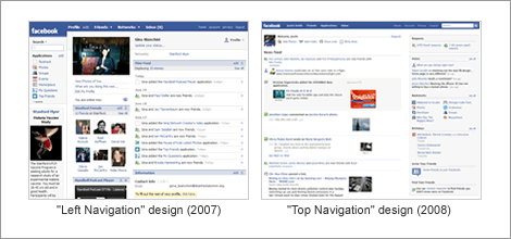
He then goes on to give an example of how this caused a similar “local maximum” problem in the design of the Facebook homepage. Back in early 2008, the Facebook homepage had all of the primary navigation items on the left-hand side. Importantly, this was how you navigated to applications, which of course are an important source of revenue. Later on in 2008, there was a radical redesign of the homepage and the applications menu went from being an exposed, highly visible list (below left) to a drop-down menu (below right). This resulted in a significant decrease in traffic to applications. They tried a few different tricks to increase usage of applications within this “top navigation” page layout, and some limited improvements were delivered.

So, it turned out the top navigation approach (shown above right) was causing a local maximum, and Facebook had to basically bin that layout and create a completely new design in order to deliver an application usage uplift. The key point here is that the analysis that got them out of this rut was not data-driven. It took a creative leap to conclude that the uplifts they were getting weren’t good enough, and they needed to try something completely different.
“What we were doing here is we were optimizing for a local maximum. Within this framework, there was only so much traffic we could funnel to applications. And what we needed was a structural change. Our premise was off. Our interests were leading us down the wrong path. We didn’t realize it […] we were optimizing for something locally, and we needed to be somewhat disruptive to sort of get out of it.” – Adam Mosseri
It’s fantastic that Facebook have the guts to share information like this, and let’s hope it continues. I guess there’s a certain level of confidence you get from from having 500 million active users that spend over 700 billion minutes per month using your site.
Some quotes in this article were paraphrased for readability. Read full transcript of quoted items
“This resulted in a significant decrease in traffic to applications.”
So — this conclusion is a creative leap and not an analysis using data?
The argument Adam presented is that they were that “Data Informed” but not “Data Driven”. I admit the distinction is rather blurred, but the point is that the data itself doesn’t tell you what to design. It seems to be human nature to use methods like AB testing to focus in on minutiae rather than big design issues like user journey flows (business logic) or page layouts.
In reality, there is no reason why you can’t use AB testing (or any quant research method) to test any design ideas, big or small.
Paras Chopra makes a good point about this in his Smashing Mag article: “Whoever claimed that A/B testing is good for creating anything? Creation happens in the mind, not in a tool. The same flawed reasoning could be applied to a paint brush: A paint brush is like a stick with some fur. You can use it to poke your cat, but you can’t really create anything with it.”
Useful; makes me think of the data-driven world of e-commerce…
Pingback: O innowacji - user experience design: projektowanie interakcji i użyteczność
Pingback: UX – Amazon a atteint un maximum local | Hi le Web
Pingback: Pre-Launch Keyword Research for Startups | ???????? ?? ??????? - ??? ??????|SEO|??????|?????|??????|??????
Great info. Thanks i was looking for this.
Pingback: How to Get Over Local Maximum? Everyone Hits It Eventually
Pingback: How to Get Over Local Maximum? Everyone Hits It Eventually | Profit Maxim Tips&Tricks
Pingback: How to Get Over Local Maximum? Everyone Hits It Eventually - News Aggregator
Pingback: Taking Small Steps… The Risk of Local Maximums | ReceiveBack