I don’t really write about Dark Patterns much anymore, partly because other people seem to be doing such a good job of it.
This video by The Nerdwriter is probably the best intro to Dark Patterns made to date. Very flattering to be name-checked too.
This slide deck by Gray, Kou, Battles, Hoggatt & Toombs is a good one. They’re a group of academic researchers with funding from the NSF to look at connecting the area of nefarious design into academic literature on ethics and values (Full paper here). What’s more their website is awesome and seems to be updated a lot more regularly than Darkpatterns.org.
The topic of ethics in design is really hot right now, somehow linking to pretty much everything currently in the news. It’s almost as if the design industry has played some sort of role in it all. This talk by Per Axbom looks like it’ll be particularly good. Love the Inclusive Panda Venn diagram:
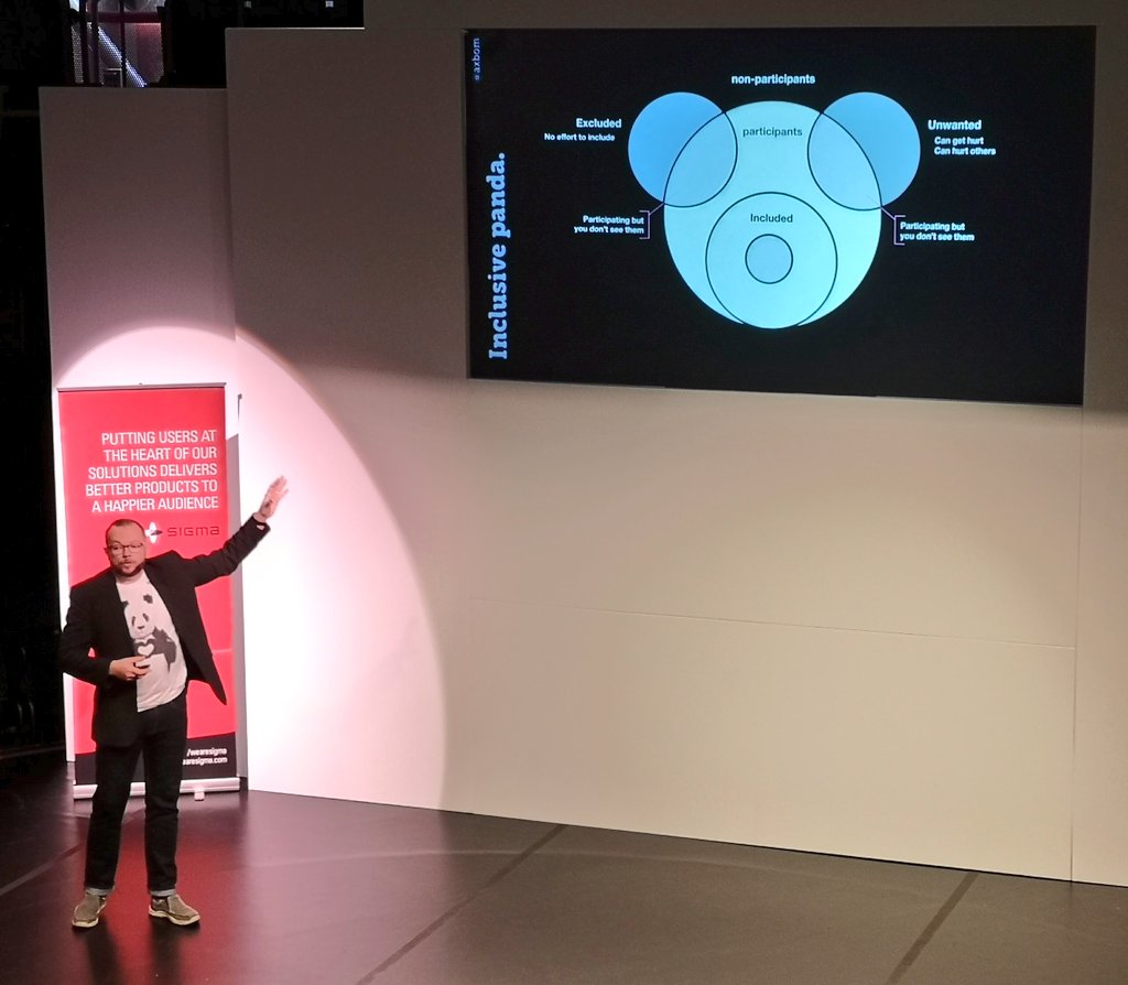
Image credit: @sookio